Thursday, August 16, 2012

TOWER REDO COMPLETE!

Nothing like before and after photos to tell the story! As you can see by the first photo, I had very little clean work space. I wasted more time looking for things than I did for stamping. How frustrating is that!


To achieve this dramatic improvement, I followed my own advice of three piles: one to give away, one to throw away and one to put away (the hardest of all!) The throw-away pile went into a few plastic garbage bags, the give-away pile is in the hallway to bring downstairs and actually give to fellow stampers and, for the rest of the story, I did a marathon rearranging of everything left. In fact, it took all week.
First, the overstuffed closet. Notice that now you can actually see the floor! There are no longer any obstacles to reaching things. The white cubicle holds odd items that have nothing to do directly with stamping but are out of the way. On top is a stack of stamping books and magazines I will go through later today with the same 3 piles in mind. The 5 containers are clearly labeled, 2 with Christmas stamps, 1 for Halloween and Easter/Spring and the bottom 2 for travel memorabilia. I still have 1 more empty one to use later, probably for Mothers Class items. To the right is a metal duct (looks gray here) that I placed all my magnets on from the fridge, which also looks neater now, too. Can you tell I was on a roll???
Meanwhile, back at the table, I moved my Cuttlebug station over to a more accessible spot next to my desk blotter. It used to sit on top of the file drawers which now fits underneath the table. The top drawer holds all my embossing folders and dies. The second drawer is for specialty 12 x 12 paper and the bottom drawer...well that's another whole story.

The biggest change is how I store my cardstock. A few years ago I bought a huge paper rack for $25 from a craft store that went out of business. I set it up in the closet, arranged my cs in color families on 36 slots and kept it behind closed doors away from the sunlight. Unfortunately, I had a hard time seeing the variety of shades in such a dark area. That rack is now in the hallway to be given away and the cs is in file folders in the bottom drawer under the CB. It's still protected from fading sunlight, but now I can see what I have. In fact, I discovered whole unopened packs of delicious SU cardstock that had been hidden. I won't need to buy any more cs for years!
Several of the items that were taking up space on the table have been moved to the second cubicle that I took out of the closet. It now holds a basket of Stickles; a basket of distress inks, pads and sponges; and a box of embellishments--all easily reached from my chair. Notice the absence of clutter on the floor!
Finally, a view of my table and desk from the door. It took hours of sorting, purging and rearranging to get things back under control; but it was all worth it!

Friday, August 3, 2012

STATE FAIR BLUES

...RIBBONS, that is! Three blue and one red--more details later...

Wednesday, August 1, 2012

FROM THE SU HOLIDAY CATALOG

The Holiday Frame embossing folder on P. 7 is soooo versatile.  Here it is with another butterfly (imagine that!) and an appropriate Bible verse.

Using a scrap of double-sided dsp, I die cut the solid butterfly, cut it in half and overlapped one over the other for a side view.  For the black overlay, I brushed some Galaxy Gloss on it and set it aside to dry.

Then I used the embossing folder on the front of a white card and brushed a Versamark Dazzle ink pad over the raised portions for a little glimmer.  I then stamped the verse on some dsp and rounded the corners plus the lower right corner of the card.  To assure that it wouldn't come loose during mailing, I attached it to the card with two large glue dots.  The gold bow was added with a smaller glue dot.

Once the butterfly was dry, I assembled it and attached it with a dimensional. It is positioned to cover the tiny Christmas tree underneath, making the oval useable for any season!


Tuesday, July 24, 2012

BUTTERFLIES GALORE!

 In case you haven't noticed, I just love butterflies; both on cards and IRL!

The blue card started out as a card that I received from Dawn, a Silver Stamper friend.  It was so pretty, I decided to make use of the front by removing a flower image in the center and attaching it to the blue cs as a background.  Already scalloped, embossed and embellished  with the two smaller butterflies, I added the large butterfly and the scalloped greeting.

Using a piece of scrap blue dsp, I die cut the solid butterfly and sponged some Wild Honey Distress Ink in the center and edges.  Then I die cut another piece of shiny black dsp for the overlay.


The second card was trimmed with a wavy edger and sponged around the edges with Distress Ink.  I added a piece of striped dsp from my scrap drawer on the inside for contrast.  The golden poppy was stamped and die cut, then mounted with dimensionals.  The greeting (a little crooked, unfortunately) was stamped in black.

For the side view butterfly, I used the SU "Beautiful Wings" embosslit, cut the wings in half, flipped one over on top of the other and taped them together with the bottom one extending out past the top one.  The black was punched with a Martha Stewart punch, cut in half and glued on top.  The body and antennae were added from another die cut shown in the previous card and glued in place.  To coordinate the wings to the scalloped edging, I added dots along the edge with a brown marker.

I resisted the temptation to re-stamp the greeting and mount it over the crooked one.  Here's a quote from the Carol Duvall Show which I have posted on my bulletin board:  "All things are literally better, lovelier and more beloved for the imperfections that reflect the human effort that went into their making."   Well said!

Sunday, July 22, 2012

READY FOR THE STATE FAIR

Here is just one of the 4 cards I plan to submit to the New Jersey State Fair this year.

Though fairly easy,  there were were many steps to the making of this card.  First I chose a double-sided dsp and matching cardstock.  Using a Martha Stewart edger, I punched the scalloped edges on the card base and top layer of dsp.  I then added another strip of dsp underneath the top layer and rounded the right side corners.  Before attaching the top layer, I added the ribbon and taped it to the back; then I placed the birthday greeting on top with dimensionals.

For the butterfly, I used two dies from Memory Box (Vivienne and Darla butterflies.)  For the solid, I chose a coordinating dsp from the same pad by My Mind's Eye.  For the black, I used a scrap of Martha Stewart Neutrals with a shiny black pattern.  I colored the body with a black Spica pen for a little bit of sparkle and used a tiny black gem for the head.

These butterfly dies are definitely my favorite!


Wednesday, July 18, 2012

SPONGED BACKGROUND

This card sort of "evolved" as I went along, not knowing how it would turn out.  It all started with a piece of white cs* with a butterfly already punched out, so I decided to try using my new sponge applicators for the Tim Holtz wooden handle I already had.  Using Distress Inks, I started with Tea Dye on the right, then Wild Honey and finally, Broken China, swirling as I went.  The sponge applicators seem to work more smoothly than the thinner cotton ones.

Next, I taped a piece of scrap dsp behind the opening (not seen here) and mounted the vellum butterfly over it.  I then sponged over a circle template in the lower right corner with Wild Honey and stamped in black over it.

After stamping the fern (SU!) in green, I added a small piece of black swirls from a 12x12 piece I purchased at Michael's.  Then I attached the vellum butterfly over the opening, added the black dots and mounted the piece onto a barely banana card with dimensionals.

*Though I love SU colored cs, I almost always use white cardstock purchased from Walmart in packages of 150.  It seems to be just fine, and is especially good for any type of overlay (and a LOT cheaper!)

Friday, July 13, 2012

HOPE Gate Card


This is a gatefold card I just finished making for someone who is seriously ill in the hospital.  I wanted the Bible verse to be the focal point, so I kept it simple.  The black swirls are cut out from a 12x12 sheet I found at Michael's the other day, and the butterfly is from the SU Beautiful Wings embosslit.


After stamping the verse from Jeremiah (one of my favorites!) I outlined the word Hope with a turquoise marker and sponged the edges of the Nestabilities label with a matching color.


The inside left panel is decorated with the remaining butterflies over a coordinating piece of dsp from my scrap drawer.  The rest of the inside is left blank for a few words of encouragement in my own handwriting.

On the subject of handwriting, it really is a lost art.  I think the age of texting and emailing has taken over.  For those who do take the time to write personal notes, however, it seems to be truly appreciated by the recipients.  Maybe we could bring it back!


 NOTE:  This thought came to mind as I read the verse:  He endured far worse than we could ever experience in order to give us a future far greater than we could ever imagine.

STAMP SHOW REVIEW

I haven't been back to the tower since the stamp show, so this is the first opportunity I've had to report on how the show was.

PROS:  There were lots of interesting booths to explore, show sale items and demos.  The very first booth we came to had packets of self-stick gems for a dollar each and 6x6 pads by My Mind's Eye for only $3 each!  I also picked up a gray marker for shading at another booth.

 Most of my purchases zeroed in on various supplies, except for the peg stamps I bought at the Stamps by Judith booth.  One was a plastic box to store sponge daubers, another was a bottle of glaze similar to Crystal Lacquer but with a brush applicator.  Another booth had a special on emb. powders.  I also bought some Gelatos after seeing a demo on how to use them--can't wait to play with them!  Crafters Workshop had a plastic template with 3 mini designs:  circles, stars and hexagons.

CONS:  The show floor was much smaller than the Allentown show, so it tended to be more crowded.  There were also areas inside where the air conditioning didn't cool well in the 90+ heat.  It was also a very long walk in from the parking lot in that heat!

All in all, it was worth attending.  However, Jackie and I left early due to tiring out and sensory overload!

Friday, June 29, 2012

OFF TO THE STAMP SHOW!

Jackie and I are going to the Scrapbook Expo in Somerset, NJ, this morning. Check back later for details on what we found there!

Sunday, June 24, 2012

CASEing the Ipad #5

I've had this stamp set a long time, but never really put it to good use--that is until I saw this card Melissa posted on her blog HERE (6/23/12 post.)

There are only a few subtle changes:  the Sizzix folder, the shadow I placed under the tree, the darker strips on the top and bottom.  I also inked the edges of the oval with the same Peeled Paint Distress ink I used on the leaves of the tree. 

For the button, I used a scrap of tan paper, stamped  woodgrain on it and punched it out with my new Epiphany Crafts button maker.

Thanks, Melissa, for the inspiration!


(The stampset used is "Thoughts and Prayers" by StampinUp.)


Thursday, June 21, 2012

Triplets

Ever try to find a card for triplets at your card store?  One of my friends tried, to no avail; so she asked me to make one.  Here's what I came up with.

Since I don't have many baby stamps in my stash, I used these diaper pins and "welcome baby" from the Short and Sweet set.  I stamped them in the openings, used markers to color the pins and added crystal lacquer.  Then I used a silver pen over the metal parts.

Without a "triplets" stamp, I improvised by stamping the greeting three times, twice in blue and once in pink, for the two boys and one girl that were born.

Inside I stamped "Count your blessings, name them one by one."  I used the tiny daisy flower from my peg stamp collection on the front and also on the inside.

After adding three strands of embroidery floss and attaching to the card base with dimensionals,  I added some pearls and tiny silver embellishments.


(For a closer look at the shine and embellishments, click on the photo.)

Tuesday, June 12, 2012

THREE OF A KIND--Poinsettia


The easiest version of this card was to stamp in Versamark and use gold embossing for the flower and plain black ink for the greeting.  The clean and simple look was enhanced by mounting the image on red cs, adding just three tiny gold gems and rounding the one corner.


Next I tried inking the stamp with red and green markers, cutting it out with an oval Nestabilities die and coloring the flowers with chalk.  I used Versamark on the light green cs as a background and stamped the greeting in black over it.  To finish, I sponged green ink on the edges of the oval, added an embroidery floss bow and mounted it to the card with dimensionals.


For the third card, I tried using markers again but left the flower plain.  Instead of sponging, I ran the oval through the CB to add an embossed edge.  For finishing, I used  gold twine for the bow and mounted the oval to the dark red background piece with dimensionals.  After creating the background with Versamark and stamping the greeting in black, I attached the Poinsettia to the kraft card with ds tape..


Monday, June 11, 2012

BACKGROUNDS AND BUTTERFLIES

 Today's workshop was on a variety of backgrounds and butterflies.  This first one featured the SU Filigre background stamp which we inked up with Versamark with the stamp face up on the table, placing the green cs over it and rubbing gently.  After sponging the edges with Versamark, we taped it to the white card base.

Next, the butterfly was made by stamping, punching and sponging the blossom from the SU Mixed Bunch set.  Then we cut away the top and bottom petals to form the butterfly, added 3 black gems and black wire antennae and mounted it to a punched black sparkle scalloped circle with dimensionals.

The greeting was stamped on a pre-cut label and embellished with green gems.


For the Rich Razzleberry card, we first ran the white cs through the Cuttlebug and attached it with double-stick tape.  We stamped the flower in black, colored the leaves green and stamped the coordinating floral stamp with a matching color ink.  Then we taped it on black cs and mounted it to the front of the card with dimensionals.  The butterflies were die cut with a SU Sizzlet die and mounted with glue dots, with the largest one inside.  This was the quickest card today.


Although pictured last here, this card was actually the first we did today.  It took a lot longer to do than I thought it would--over an hour!  There were a lot of steps for this one:  spritzing with spray inks on the white panels, then rounding the corners and attaching the jute around it before mounting it to the card.  The butterfly was stamped with Versamark and embossed with black ep.  The Bible verse was stamped in black, taped to the black cs and embellished with more jute tied in a bow.  Placement on the card was done, after alining it with the jute beneath and using dimensionals to secure it to the card.  The butterfly was then cut out, its body colored with a black marker and attached with dimensionals.

In spite of all the work it took to complete the cards, they all came out great!

Christmas Blessings

Since this stamp is so delicate, it's a real challenge to present it in a way that keeps it simple but not dull.

For this card, I used gold embossing for the image and shaded the poinsettia with one ordinary red Crayola colored pencil. I colored each petal lightly, then darkened just the inner parts of the leaves to give it depth.

For added interest, I cut 1/2" off the side of the green cs and attached a strip of red that was punched with a Fiskars edge punch.  Then I wrapped the white cs with red metallic cord and mounted it on red cs with dimensionals and attached it to the card with ds tape.  Three tiny red gems were added for the final touch.


Saturday, June 9, 2012

Christmas Stamp-a-Stack

Here's the card I came up with for the workshop I'll be hosting at my house next month.  I pulled out an old stamp from Christmases past and bought some new dsp from Hobby Lobby.

Starting with a Crumb Cake cs base with a side fold, I used the Hero Arts woodgrain background stamp with Versamark.  Then I cut the dsp to 4 1/4" x 2 1/2" and attached it with ds tape.

After stamping the tree on Confetti White cs with Versafine Olympia Green ink, I cut it out and sponged the edges with Peeled Paint Distress Ink, added the gold star and mounted it on the card with dimensionals.  Last, I added the jute, tied with just a knot, on the left side.

I took the photo on my messy table so you could see it in its "natural" environment!


Friday, June 8, 2012

Rejoicing with You

The new SU sets are here!  My SU demonstrator put my order in with hers on June 1st so that it would arrive ASAP.  This is the first card I made with this stamp, and I love it!

The Sizzix ef just begs for something to be added on the top left, so I used a Hero Arts flower with a Stampendous gold dot sticker in the center.  I used a punch for the green ferns underneath and mounted them with a glue dot.

The angel is gold embossed for a simple Christmas card that will be easy to duplicate quickly.  One of the sentiments in the set will go inside and another on the envelope.  This will probably be my first 25 cards (out of 100!)

CASEing the Ipad--#4

As soon as I saw this card on Simple & Sincere (May 24th post) I knew it would be just right for my grandson's graduation card!

Changing to Northwest Christian School colors of blue and gold,  I followed the guidelines I just taught at Mothers Class for masculine cards:

texture
deep colors
bold lettering
metallic embellishments and
no bows or ribbons!

After running some cs through the Cuttlebug with a rick-rack die, I attached them to the bottom of a white panel and trimmed the excess.  Using dark blue ink, I stamped the Congrats just above the rick-rack.  Then I used a Sizzix die for the stars and added a gold star in the center of the large one and mounted them on the panel.  After running the yellow card base through the CB with an embossing folder, I tied gold cording and navy embroidery floss around the top-fold card.  After attaching the complete white panel to the card, it is now ready to give on graduation night.

Thank you Jen for such a great idea!

Monday, June 4, 2012

SUN AND RAIN


One embossing folder, two different looks!

The sunny card started with a blue cs base.  The rays were embossed and colored by gently rubbing with a yellow ink pad.

After stamping grass along the bottom, I used my peg stamps to add bright summer flowers.  The tag stamp was inked with markers so that the flower would match the others and punched out with the corresponding SU punch.  With the blue embroidery floss in place, I attached the tag with a dimensional and mounted the "scene" onto the card base.

For the rainbow card, I streaked the beams with a Soft Stone ink pad to look like rain.  The cloud is also edged and streaked with the same pad.  The rainbow was done with Sharpie markers on a piece of acetate, cut and attached with invisible tape.  Since I wanted the cloud to extend beyond the top of the card, I cut a strip off the bottom so that it would fit in the envelope.  Then I stamped the message on white cardstock and cut it in two sections in an irregular shape.  I had some striped paper in my scrap drawer which was just right for the card, so I taped each saying onto larger pieces and trimmed it with scissors.  The stamp is from an Inkadinkado set of "Kid Quotes" entitled "Friendly Advice."  This quote was from Alyssa Knight, age 12 (credited on the inside of the card.)  Sounds like good advice to me!


Sunday, June 3, 2012

CASEing the Catalogs--Floral set

What drew me to this card on Page 83 of the new SU! catalog is the fact that I have this set, but seldom use it.  After trying this layout, I definitely will be using it more often!

First, I found a large scrap of pale green cs which I cut down to 4 x 5 1/4".  I stamped the Filigre background in Soft Stone ink and distressed the edges of the paper.  Since it's a fairly heavy cs, slightly textured, the edges "fluffed" up nicely.  I then inked the edges with Soft Stone and taped it to the white card base.

Next, I stamped the leaf from the Fabulous Florets set onto a piece of white cs using Peeled Paint Distress Ink and cut it off-center with a Nestabilities label die.  Then I spritzed it with a gray marker and laid it aside while I stamped the flower with Brilliance Pearlescent Purple, cut it out by hand and attached it with a SU dimensional.  The butterfly is from a piece of scrap that I die cut with the Embosslits Beautiful Wings and attached with a glue dot under the right wing.  The banner is stamped, cut out, curved with my bone folder and attached with another glue dot just to the right of the green gems.

Finally, I mounted the label to the card with dimensionals.  Although there were quite a few steps to this card, it was very easy to do. 

Friday, June 1, 2012

CASEing the Ipad--#3

Here's another simple card featured on Lime Doodle.
This one takes no more than 10 minutes to make!

First I took a top fold white card for my base.  Then I ran a piece of kraft cs in an embossing folder through the Cuttlebug and cut it to fit on another layer of white cs.  After attaching both to the base with dimensionals, I added a piece of white satin ribbon, folded and held together with glue dots, avoiding a bulky knot.  After die-cutting a square button from a scrap piece and tying on some linen thread, I added the button to the bow with another glue dot.

Last, I stamped the greeting below with dark brown ink...done!


(If this looks a little blurry to you, just click on the photo for a closer view.)

Thursday, May 31, 2012

FROM MY FILE--5th Ave. Floral

Having cleaned off my stamping table last week, I came across a bunch of pre-stamped images and decided to use them.

This rose from SU's Fifth Ave. Floral set was white embossed and just needed to be colored and cut.  For the color, I sponged on Wild Honey Distress Ink.  The green cs was already embossed, so I popped the rose out and added the Bible verse.

After sponging the edges of the green cs with Versamark, I taped the green to a layer of white cs and mounted both on a gray card with dimensionals.  The crystal flower and seed pearls were all that were needed for final embellishment.

Having a folder of pre-stamped images makes it easy to quickly create something special.

Tuesday, May 29, 2012

CASEing the Ipad--#2

Here's another card I couldn't resist CASEing.  Don't you just love those leaping Holsteins featured on   Lime Doodle?  (May 25th post.)  Since I have no cows in my collection, I had to settle for a poppy and a butterfly.

The poppy and butterfly are from a flower set by Inkadinkado.  The blue gingham clouds were die cut and the grass was cut from a strip of green gingham, clipped and attached with ds tape.  I cut the top-fold card a little narrower so that it would fit in a standard envelope with the clouds going off the edge.

The Lime Doodle blog is a great source of card ideas, so be sure to stop in and leave a comment or two!  Then hop on over to There She Goes for a look at some of their beautiful stamp sets.

Sunday, May 27, 2012

CASEing the Ipad #1

This is the first of a new series, similar to CASEing the Catalogs.  There are so many wonderful blogs that I follow, and this is just one of them: Bits and Pieces.  Be sure to visit for some inspiration!

The stamps I used were SU French Script for the background and Hero Arts Two Birds for the rose and Essential Messages for the greeting.  I sponged with Tea Dye Distress Ink and layered the image on brown and black panels over the white card base.  Then I added a bow of silver cord and light brown embroidery floss for embellishment.

Thank you Heather for maintaining such an inspiring blog!

Friday, May 25, 2012

ACETATE ART

I FINALLY GOT A CHANCE TO CLEAN OFF MY STAMPING TABLE!!!

One of the things I found was a fresh piece of acetate just waiting to be used.  I stamped the Hero Arts Large Flower background stamp in Versamark and embossed it in black.  Then the fun began:

First, I cut it down to highlight two of the blossoms.  Then I colored on the backs with Sharpie pens, one blue and one red, with bright green leaves.  Then I chose some background papers that would look best.  I mounted the acetate on the dsp with invisible Vellum Tape, which really IS invisible!

Next, I wrapped some embroidery floss around each one.  For the Thanks card, I added a pewter brad in the lower left corner and rounded the upper right corner before attaching the finished piece to the card.  I also rounded the corners on the underlying dsp and card base.  For the red one, I mounted the image on black cs before attaching to the dsp/card base with dimensionals.  Last, I added 3 red Hero Arts blossom gems.

Making these cards was much simpler than I expected, in fact it was downright fun!  The clear sheets I used are from a pad of Grafix Dura-Lar overlays for overhead projectors.  I think it's heavier and clearer than actual acetate would be, which may be why it was so easy to use.  The pad is 25 sheets of  9x12"  medium weight transparencies which I purchased in the art section at Michaels.

I think I like the blue one best because of the way the striped dsp shows through the blossom.  (Don't forget to click for a closer view.)

Monday, May 21, 2012

THREE OF A KIND--Hero Arts Background Stamp

Who would have thought you could do so much with a background stamp!  (Hero Arts, of course.)

For details on how these cards were made, go to the three previous posts.

ANOTHER LARGE FLOWER DESIGN

So many possibilities with this stamp!  First, I stamped and embossed in white on a burgundy dsp sheet that had a raised criss-cross design.  To make the design show up, I painted the flowers with a mix of opaque white color mist and white glimmer mist using a paint brush and acrylic block for a palette. (Click on the photo for a closer look.)  The leaves are colored in with a SU  Forest Foliage marker.

For the next layer, I stamped on green with Versamark and clear embossed.  For the white layer, I reinked the stamped in CMH Garden Green, which barely shows up so as not to make the card look too busy.

For the shapes, I used three Nestabilities label dies.  On the white, I cut above the fold to form the card base and sponged the edges with VersaFine Olympia Green.  On the green, I cut and then embossed the edges.  On the top layer, I just cut one section of the stamped area.  The greeting is stamped in Olympia Green on white and mounted on a scalloped piece of the same dsp used for the white embossed image.

To assemble the card, I taped the top layer to the green layer and tied green embroidery floss around them.  Then I attached them to the card base with SU dimensionals and did the same with the greeting.  For embellishment, I added just the 4 crystal gems on the lower left corner of the green.

SAME STAMP, DIFFERENT LOOK

I'm lovin' this Hero Arts Large Flower background stamp, as you can see from my previous post!

Utilizing scraps on my table once again, I started with the large piece of  kraft cs.   After embossing in white, I trimmed it down to make it even.  Then I colored in the blossoms and leaves with SU markers (Baroque Burgundy and Mellow Moss.)  The green corrugated paper was laying on my table with a circle cut that didn't quite go through, which is probably why I  left it laying there.  Since the circle wouldn't show, I simply mounted the floral piece with double stick tape and wrapped the red embroidery floss around the left side.  Then I attached it to the card with double stick tape so that it wouldn't be too thick for mailing.

For the greeting, I had a small piece of dsp on which I stamped in dark green ink and punched it out  with an oval punch.  Another scrap of green was used for the scalloped oval.  I mounted them on the card front with dimensionals.  The fun part was in the embellishments adding silver, pearl, crystal and olive green gemstones to the front.  (Click on photo for a closer look.)

Simply changing the greeting could also have turned this into a Christmas card!


Sunday, May 20, 2012

Wobbly Spring

This was a fun card to make!

Using the Hero Arts Large Flower background stamp, I first stamped it on white cs with Versamark and clear embossed it.  Then I sponged Distress Inks (Peeled Paint, Broken China, Tea Dye and Wild Honey) over the image and wiped the excess off with a tissue.  The green card base just happened to match, so I taped it on the front with double-stick tape.  That's as far as I got the first day.  I couldn't think of where to go from there.  Does that ever happen to you?

Today, I decided it was time to finish.  After stamping a portion of it again and using the same colors, I cut out the one flower and attached it with an Action Wobble Spring I purchased online.  I tied a matching bow on the stem and decided to add a greeting.

Well, wouldn't you know I had a scrap piece of solid dsp just laying on my table waiting to be used.  I thought the greeting, in my warped sense of humor, gave it a play on words totally appropriate.  Three light green pearls gave it that final touch.

Now all I have to do is stop making it wiggle!  (It's addictive!)


Saturday, May 12, 2012

MOTHERS DAY CARD


  Here's the card I made to give my daughter-in-law tonight for Mothers Day.  This will also be the card for Mothers Class on Wednesday.

Using a white confetti cardstock as the base, I cut a plain circle with a Nestabilities die.  I then cut a scalloped circle, slightly larger, out of a 4x5 1/4" overlay.  Next I cut a 3 3/4" square piece of acetate and taped it to the back of the overlay.

Using the Mixed Bunch punch from SU, I punched two flowers out of double-sided dsp (also from SU) and three 1 3/4" circles for the flower centers.  Then I started making a sandwich--paper one, that is (lol.)  First, I mounted the circle onto the front of the acetate with a glue dot.  Then I mounted the blossom to the back of the acetate with another glue dot before mounting the overlay to the card.  This completed the acetate "sandwich."

For the inside, I added the contrasting circle to the back of the blossom.  To mount the second blossom so that it is perfectly aligned, I placed a piece of ds tape on the back and laid it over the first one with the tape facing up.  Then I simply closed the card over it to transfer the blossom to the inside panel of the card.  After adding the center circle, I wrote a personal Mothers Day note on the bottom.

To finish the front of the card, I added the button and embroidery floss.  Then I punched the butterfly twice with a MS punch, one in the same paper as the overlay and one in a black polka dot scrap.  For the final touch, I added the black gems to the b'fly and spread some Stickles on the wings with my finger to give it a sheen.

Since the Mothers Class will be after the holiday, we will turn this card into a get well or birthday card.  Meanwhile, I hope everyone enjoys a wonderful Mothers Day!

Wednesday, May 9, 2012

Watercolor Tips

Here's how I watercolored the previous card (and others) using Distress Inks: Using a clear stamp mount, I first rub some ink onto the block as a "palette" and paint with a water brush on the card. You can also do the same thing with water based markers by scribbling on the block. When painting an image, I start with the lightest color and blend with darker ones until I get the shading I want. Cleanup is easy with just a tissue.

Monday, May 7, 2012

Hello Note Card

Here's a simple little note card that I may just use for an extra project this Wednesday at the Mothers Class.

First, I stamped the flower in India Ink black and colored it with a watercolor brush using Wild Honey and Fired Brick Distress Inks.  Using an acrylic ruler and a black SU marker, I drew two boxes around the flower.  I darkened the inside box for contrast around the petals, then drew wavy lines and dots in the "frame" for added interest.  (Click on photo for a closer view.)

Next, I wrote the "hello" free hand and embellished the flower center with yellow Stickles.

Finally, I cut off some of the bottom to make the card a square and rounded the corners.  I plan to show the class how to alter a large envelope to accommodate a smaller card as shown HERE.


TOPSY-TURVY SPRING

This is the card I came up with for the Topsy Turvy challenge on the Hero Arts blog HERE. (See May 1st post.)  The idea is to use word stamps in ways other than the greeting, so I used it as sun rays for Spring.

The flower was done with quilling, and the grass is torn cardstock.  Pretty simple!  (Although I have tons of Hero Arts stamps I could have used, this one is from Purple Daisy Designs.)  The card base is kraft cardstock.

Here in NJ, the Spring weather seems to be topsy-turvy with April being sunny and above average temps and May being rainy, damp and dreary.  Maybe that's what drew me to this challenge???

Friday, May 4, 2012

CAT-LOVER'S BIRTHDAY CARD

This birthday card (for the neighbor who usually takes care of our cats while we're away) features a Basic Grey page from their Max and Whiskers collection as the main focal point.  One of the things I like about using papers from a collection is that they all coordinate in color and style.  The orange background used here (from the back of the pad) matches beautifully.

After attaching a Hero Arts ribbon and adding a cat brad from the same set, I taped the background down to the card.  I then added the scalloped dsp with ds tape and the scalloped ovals with dimensionals.  Using a black glitter letter set, I translated "Happy Birthday" to cat language, decorated with a variety of gems and stamped a sentiment inside.

When I sign the card, I will include our cats names, too!


Thursday, May 3, 2012

LESS IS MORE CHALLENGE--Square Card

Another challenge today!  I guess this week has been "catch up week."   This one is for Less Is More HERE.

When I first stamped the frame and cut the card down to size, I thought it would never work.  In fact, I was going to scrap it; but I decided to keep going anyway.  I kinda like the way it turned out.

The frame and sentiment are from a Papertrey Ink set with a matching die (not used here.)  The flower is from a Gina K. set of Spring flowers, very appropriate for this month.  The bracket next to the greeting was hand drawn, and the flower centers have a dab of yellow Stickles on them.

I usually shy away from making square cards because of the extra postage needed for a square envelope.  But here's a way to get around that:

TIP:  First, start by making the card a 4 1/2" square, as I have done here, so that it will fit the standard A2 envelope.  To fill the extra space on the side, use a small punch to create a window in the lower right- or left-hand corner.  Next, select a color coordinating piece of scrap dsp and cut 2 strips 4" long and glue them back to back.  (This is not necessary if the paper is double-sided.)  Add a small piece of tape front and back at the top 1" of the strip and slide it into the side of the envelope so that the dsp shows through the punchouts as shown.  Your square card will now fit the empty space perfectly, and the dsp will add a decorative touch to the envelope.

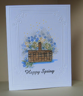
SPRING BASKET BOUQUET


Once again, I gladly pulled out my peg stamp drawer and created this basket of flowers for the Tic-Tac-Toe challenge on the Paper Players HERE. The three squares I chose were Flowers, Blue Colours and Spring.

If you haven't tried them yet, peg stamps are tiny stamps on wooden dowels that you can use in many different ways.  I've used them for wreaths, borders, vases and outdoor scenes.

The ones I used to fill the basket were a leaf sprig, single flowers (in blue), triple flowers (yellow), pine sprigs that can also look like asparagus ferns, and dots around the top (yellow).

This Spring has been "happy" so far, with lots of warm sunny days and some much needed rain in between.


Wednesday, May 2, 2012

A MAZE-ing Mothers Class Card

Today at Mothers Class, we made this card.  We only lost one bead in the process!

Before class, I precut the circle opening in a variety of dsp overlays using a Nestabilities circle die.  Then in class, we each stamped the maze and cheese on white scrap pieces and punched them out with a 2" punch.  Laying the mazes  upside down on the table, we easily removed the backing and substituted the stamped maze image.  The hard part was lining up the stamped maze with the actual paths on the plastic cover without losing the beads.

Next, we stamped the mouse and sentiment, punching them out and mounting them on the card front as shown.  Before inserting the maze piece into the hole, we ran a tiny line of TomBow white glue around the edge of the maze and laid the dsp over it.  The cardfront was then attached to the white base with SU dimensionals.  Finally, we added the embroidery floss on the side.

An a-MAZE-ing time was had by all!


Monday, April 30, 2012

GETTING MISTY


It was fun going to the post office this week with new toys arriving!  One packet had Dylusions ink spray, another had Mister Huey's Color Mist and another had a Hero Arts stamp set and some gems.  What inspiration!

This card started out with a piece of soft green cardstock that I trimmed to fit the space.  After using my Fiskar's edge punch on the right side, I rounded the corners on the left side and placed it in a cardboard box for misting.  First I sprayed it with Dylusions Cut Grass, then with Mister Huey's Orchard and Opaque White.

The designer paper is from the Mabel collection by My Mind's Eye, cut to fit the card and corners rounded.  Punches were used for the leaves and flowers from scraps.  Once the inks were fully dried, I assembled the card as shown using dimensionals for the misted piece and the oval.

Now I know firsthand why misting is all the rage lately--it's just plain FUN!

EMBOSS RESIST CHALLENGE


This card was created for the Emboss Resist Challenge HERE.  I'm glad this wasn't also a CAS challenge since I used three layers and added the flowers and butterflies to fill the empty space.

First, I stamped the Hero Arts large flower background on the card base with Versamark, embossed with clear ep and sponged Peeled Paint Distress Ink on the edges.  The next layer is a dsp pattern from My Mind's Eye.

Next, I stamped the Bible verse, clear embossed it and sponged with a mix of  Peeled Paint and Wild Honey Distress inks.  After stamping the flowers and painting them with the same distress inks, I attached it with SNAIL and added the butterflies (SU Embosslits Beautiful Wings.)

Finally, I attached the top layer to the card with dimensionals and placed gold beads on the butterflies and 2 flower centers.  Unfortunately, I needed this card and Bible verse for a sympathy card today.

CAS-ual Fridays Challenge


This week's challenge was to make a CAS card using trees or flowers.   You can see the other entries HERE.

This flower was done with red cardstock strips that were quilled to form the petals and buds.  Pearls were added to accent the centers.

Quilling is a fun way to make flowers and other images--try it!

Sunday, April 29, 2012

NEW BABY HAS ARRIVED!

Sometimes you want to say something special, but don't have a stamp for it.  There's no reason why you can't just write something on the card, even if you have to practice on scrap paper first.  This bouncing baby boy was delivered last week, so this shaker card will be going out tomorrow.

The inside is stamped with SU "Congratulations," and I added a brief welcome in my own handwriting again.

Penmanship doesn't have to be perfect to make a card more personal!

Monday, April 23, 2012

A HAPPY HELLO

Inspiration for this card came from a new pad of paper from Die Cuts With a View, "The Green Stack" which I picked up at AC Moore last week. The design is from a sketch HERE at CAS-ual Fridays.

First, I used my Scor-Pal to make diagonal lines, highlighting the pattern on the animals.  I then cut out two circles and mounted them on the card front, one with glue dots, the other with dimensionals.  The greeting is from a Hero Arts clear stamp set.

Rounding the corner and adding the lime green embroidery floss finished the card, keeping it clean and simple.

SUMMER PASTELS

To get the watercolor look on the base cardstock, I used three Distress Ink pads (Peeled Paint, Broken China and Tea Dye.) I smeared a patch of each color on an acrylic block, added some water and used a wide paintbrush to swipe across the card.

Next, I took white cardstock (cut down to 5 x 3 3/4") and used the CB butterfly to make the cutout. Then I stamped the Hero Arts "Manuscript Background" at different angles and applied Broken China distress ink to the edges. Before attaching it to the card, I placed it in position and marked a few tiny dots down the middle of the butterfly before stamping with black ink. I had planned to use one of the Pocket Silhouettes, but couldn't find it*; so I used this image from the SU "Autumn Days" set.

The sentiment is from another SU set, which I mounted with SU dimensionals. After adding a variety of gems from a collection I purchased at Michaels, I mounted the overlay to the card with SU dimensionals.

We are finally getting some much needed rain here--good stamping weather!


 *My "Tower" is in need of cleaning up so I can find things easily again...

Thursday, April 19, 2012

WDW Photos

A few select photos have been posted to my family blog HERE if you'd like to stop by!

Herringbone Design


After watching Beate's video tutorial, this card was a cinch to put together!

AC Moore had designer papers on sale for 40% off, so I took advantage of the opportunity to purchase some My Mind's Eye 6x6 pads. I used one of them for this card, cutting strips of various widths. Besides having nice designs, the pages are also reversible in these pads.

If you watch the tutorial on Splitcoast Stampers, the rest of this card is pretty much self-explanatory. I plan to use this for our next Mothers Class.

I'M BACK (Almost...)

Check back tonight for some news and new posts!

Tuesday, April 10, 2012

Greetings from WDW!

Having a magical time at Disney World! The weather has been perfect, and it's been wonderful to spend so much time as a family. The grandchildren have been having fun both at the parks and at the pool.

Haven't missed stamping (sorry...)