...and it may be my last! This took a few hours to make and decorate; but I'm happy with how it turned out. I got the instructions and dimensions on YouTube*, but I had to search awhile before I found one that used an 8 1/2 x 11 sheet and had measurements in inches instead of centimeters.
Can you believe that with all the flowers and butterflies on all sides and from the middle of the box it will all fold flat and fit into a standard sized envelope--WOW!
This is going to someone VERY special.
*To access the video on YouTube, type in "card in a box" in the search box and scroll down to the one by "stampingt." The C6 envelope (Australia) is the same as our A2 size.
NOTE: This card turned out to be 4 1/2 x 6", so I had to use my Envelope Punch Board to make an envie for it. So either make your envelope to fit or just trim an extra 1/2" off the top panels.
A site to post my latest hand-stamped greeting cards. BE SURE TO CLICK ON PHOTOS TO ENLARGE!
Monday, March 3, 2014
Saturday, March 1, 2014
TGIM!
THANK GOODNESS IT'S MARCH! I have never been so glad to see the month of February over with. Unfortunately, March is starting off with continued vigor in the snow department with 4-8 inches due Sunday into Monday, followed by record low temps. However, it does have a reputation for going out like a lamb!
May Spring be with us all SOON!
Friday, February 28, 2014
Inside and Out--Online Classes
The first lesson was on different ways to make pop-ups on the inside, which inspired this card. The video shows 3 ways to use a small cube on which to mount an image. Since the card base was too dark for writing a message inside, I chose to use a white insert instead; but the idea is still the same. As you can see, the inside is a continuation of the theme on the front. These online classes are so helpful!
NOTE: The online class title is "Insider."

Thursday, February 27, 2014
GREENHOUSE SOCIETY--Peony
If you love botanicals as much as I do, check out the Greenhouse Society stamp sets HERE at Technique Tuesday. Membership entitles you to automatic monthly delivery of their beautiful stamp sets at a discount.
This was the set for January, and I used it for a shaker card with tiny green beads and purple flakes. The greeting is also part of the set.
Enjoy!
This was the set for January, and I used it for a shaker card with tiny green beads and purple flakes. The greeting is also part of the set.
Enjoy!
Thursday, February 20, 2014
SIMPLE THANKYOU CARD
Our pastor most likely could use a few thank you notes, so I added this to his next batch of cards
After sponging a stencil with Hero Arts Pool ink, I ran the card front through the CB with this thanks ef. Then I cut the oval with a Nestabilities die and set both aside.
Since I had the Morning Meadow set out, I stamped the blank scrolled image in pool ink, then stamped the thank you in the center with a darker blue ink. Next I fussy cut the image, mounted it on the oval with dimensionals and attached it to the card front with glue dots. Finally, I rounded all four corners.
Easy!
FROM THE SCRAP DRAWER #36
In keeping with my self-imposed challenge to use only what I already have in my stamping tower for the rest of the year, I came upon this barely used SU Hostess set. Actually, I have five newer Hostess sets all together. So why would I NEED to buy more??? Well, "need" is definitely a relative term in stamping!
This was fun to make as I pulled out all the scraps. First I inked up the French Script background stamp with Pumice Stone Distress ink, stamped off lightly and stamped it on a scrap of white cs for a faint background. Next I stamped the floral image from Simply Soft with "full strength" pumice stone ink. For the blossoms (this is a two-step set) I used an Eggplant Purple dye ink that I've had in my stash for at least 10 years! It was still surprisingly juicy enough for a clear image and birthday greeting.
In my dsp collection, I found just the right color purple and green pieces to use (as shown) to highlight the flowers without overpowering them. I colored the stems with a Mellow Moss marker and mounted the panel to a mellow moss scrap of textured cs, which I also used for the greeting. For the final touch, I brought out the gems and embroidery floss, attaching all as shown.
Although this has been quite a challenge -- and it's only February -- I'm amazed at how much I have at my disposal, even after the last few purges and giveaways!
If you'd like to join me in my "stamping diet" challenge, see the post on January 19th.
Monday, February 17, 2014
THREE OF A KIND--Oval Frame
It's been awhile since I've done three of a kind for the blog, so I thought I'd have a go at it with the SU frame ef.
This first one is stamped with Distress inks and sprayed with water for the watercolor effect. The leaf is a stamp and matching die from Impression Obsession; and the flowers are from a SU hostess set, "Morning Meadow". I used the coordinating punch for the flowers. The tiny pearls go along with the raised dots around the frame.
The second card uses the poppy stamp from another SU hostess set, "Simply Sketched" and is the first time I've used it. The greeting and flower are stamped in Versafine Smokey Gray ink to match the gray cs. I kept this one very simple, adding just some tiny black gems and a black embroidery floss bow.
The last card uses a daisy die cut which I water colored and added Stickles to. The greeting is stamped in Versafine Olympia Green ink. I added a green strip and just a few embellishments to finish it off.
Are you as eager for Spring as I am????
Sunday, February 16, 2014
WATERCOLOR BIRTHDAY CARD

Next, I used a tiny flower peg stamp with the same blue inks to continue the watercolor look. For the birthday message, I stamped the typewriter from the SU "You're My Type" set with Versafine Smokey Gray ink.
To finish, I attached the panel to an olive green textured cs with double stick tape and mounted it to the card front with dimensionals. For the final embellishment, I added three small sequins. Done!
Labels:
Peg Stamps,
Postage Friendly,
Stampin' Up,
Watercolor
Thursday, February 13, 2014
Valentine Wildflowers
This is one of the Valentines I sent out this year. After taking the internet class on stenciling last month, I made the heart stencil using a punch and a piece of cardstock. Then I sponged red ink over it onto the white panel and stamped the flowers and verse over it.
Before adding color to the flowers with colored pencils, I trimmed the panel to size, rounded the corners and mounted it to the blue cs with TomBow Mono glue. The smaller flower was added from my collection to give it a little sparkle, and yellow Stickles was used for the centers of the other two blossoms. While waiting for the Stickles to dry, I ran the card base and embossing folder through my Cuttlebug and stamped the sentiment on the inside.
Happy Valentine's Day everyone!
Secret Message Thank You
Here we are in the midst of yet another huge snow storm--a good time to stamp!
This secret message card is for someone who sent me a lovely Valentine card. The base card is kraft, but the front panels are a light green. The flowers are colored to look more like poppies than daisies.
When the card is first opened, you see the back of the front square, which is why I used red for the flowers. The white boxes are for the letter I'm writing. Although it's hard to see here, there are snow flakes stamped in white on the kraft rectangles.
Once opened up to reveal the secret message, there are flowers stamped with peg stamps on the kraft pieces. The white rectangles are used for the words of encouragement hand written in green.
For instruction on how to open the card (or make it) just go to Utube or Google and type in secret message card. Lots of them will come up!
Opening the card is so simple once you know the trick. Enjoy!
(Click on photos to enlarge.)
Wednesday, February 12, 2014
Special Card for a Special Friend
If I ever get out of my driveway to go to the Post Office, I'll be mailing this card to someone special who sent me a batch of these falling heart panels. Somehow, I opened the card when it came (I can't even remember when) and set it aside. I guess I got distracted after that and the envelope got mixed in with other papers until today. What a happy discovery!
Thank you, Kim. I hope you like the card and know that I truly appreciate your thoughtfulness.
Friday, February 7, 2014
Spinner Valentine Card
Interactive cards are always such fun! To "set" the spinner before mailing, just blow on one side of the circle, then stop it with your finger and put it in the envelope. When the recipient opens the card, the circle will spin automatically.
Meanwhile, you can play with it for awhile before sending it... *wink* Watch out--it's addictive!
(See previous post for a birthday version of the same design.)
Meanwhile, you can play with it for awhile before sending it... *wink* Watch out--it's addictive!
(See previous post for a birthday version of the same design.)
Thursday, February 6, 2014
Fabulous Floret ala Brandy Cox
If you haven't discovered Brandy Cox's videos on Utube, you are really missing
out! This card is patterned after her gorgeous butterfly card, with
some variations of my own. First of all, mine is a side fold; hers is a
top fold. One advantage of the side fold is that you don't have to
remember to place the inside image upside down so that it's right side
up when you open the card. I wish I could say I brilliantly thought
that up on purpose, but it was because I forgot to make it a top fold.
However, from the front they both look similar in design.
Next, in order to have some contrast between the floral circle and the white cs on the inside, I added the green circle that was die cut from the front so that it
would be directly behind the flower opening. Once I did that, the flower just popped!
For instructions and video, just go to Utube, type in Brandy Cox and look for a yellow butterfly card.. Then sit back and enjoy!
Wednesday, February 5, 2014
CASEing the iPad #10
With all the snow and ice we've been getting lately, is it any wonder I keep choosing green for my cards???
This one was inspired by Splendiferous Creations HERE. Lisa Somerville does beautiful work!
Using a stencil buried deep in my stash no longer, I sponged two shades of green and one yellow of Distress Inks, blending the colors as I worked my way down the card. The message is white embossed on a scrap of tinted vellum (green, of course!) The square at the top of the tag is silver metallic, although it looks gray here. After decorating the tag, I mounted it to the stenciled piece with a craft glue dot at the top and then mounted the panel to the card with dimensionals.
I'm looking forward to seeing some green grass again SOON!
CASEing the iPad #9
I haven't CASEd (CopyAfterSomeoneElse) in quite awhile, but since I'm stuck in my house during the latest round of winter storms...
This is one of those cards that looks better IRL than here. (My card isn't quite so yellow.) Although mine turned out quite a bit different than the one I copied, I still like it. If you'd like to give it a try yourself, check out the Cardography blog HERE.
Thanks Therese for the inspiration!
This is one of those cards that looks better IRL than here. (My card isn't quite so yellow.) Although mine turned out quite a bit different than the one I copied, I still like it. If you'd like to give it a try yourself, check out the Cardography blog HERE.
Thanks Therese for the inspiration!
Sunday, February 2, 2014
HEARTS AND FLOWERS
Love those scraps! They all happened to match beautifully (the hearts panel isn't as red as it looks here.) I ran the punched white heart through a floral Cuttlebug embossing folder and added another white flower on top. The gem under the "you" is a heart shaped one, and the pink heart in the "O" is also popped up with a dimensional.
Next stop: Super Bowl (on TV!)
Tuesday, January 28, 2014
FOR OPENING DAY AT MOTHERS CLASS
We usually wait until the first week in February to resume our Mothers Class stamping, but we're all suffering from stamping withdrawal. Besides, January has 5 Wednesdays this year, so that's our excuse for not waiting until February--YAY!
This is the first card we'll make in class. I just learned this chevron technique, so it should be fun.
Monday, January 27, 2014
CARDINAL CARD
With the weather we've been having, I'm stamping up a storm...literally!
This is an oldie but goodie from SU which I stamped in Versafine black and watercolored. Although it was a bit time consuming, it was an easy one to do. All I added was a scrap of black cs for the border and a tiny black gem for the eye.
Enjoy!
This is an oldie but goodie from SU which I stamped in Versafine black and watercolored. Although it was a bit time consuming, it was an easy one to do. All I added was a scrap of black cs for the border and a tiny black gem for the eye.
Enjoy!
Labels:
Pastor cards,
Postage Friendly,
Stampin' Up,
Watercolor
Sunday, January 26, 2014
Saturday, January 25, 2014
ENVELOPE CARD
In keeping with my own challenge to use only what I already have in the tower to the end of this year, I rediscovered this stamp and used it today.
After stamping it in black ink on dsp, I made slits where the opening would be to insert the tag as shown. Then I mounted it on a scrap of textured vanilla cs and cut around it to make the border.
The background is stamped in Versamark Frost with both large and small swirl stamps. While it dried, I placed foam mounting tape on the back of the envelope and added three tiny black gems at the intersection of the lines. Once the Versamark dried, I mounted the envelope with its message inserted.
So far, this challenge has been easy. I've been finding lots of stamps I'd forgotten about and plan to use them soon. The real challenge will be in the Fall when I start running out of adhesives and cardstock!
Friday, January 24, 2014
I WON! I WON!
Hero Arts Online Classes on Stenciling drew winners from comments left on their blogs, and I was one of them--YAY! Classes started today, so I wasted no time in putting the new information to good use on this card.
Since I don't have any stencils, I made one of my own from a Martha Stewart stars punch and a scrap piece of cardstock. After sponging the stars onto the white panel, I added the "Birthday" die cut, the "wishes" and some extra stars from a small punch. The embossed zig-zag line on the bottom is from a Sizzix border ef. Now that it's mounted on a card front, I'm entering it in the Sweet and Sassy challenge HERE!
I'm on a roll!
Thursday, January 23, 2014
HUMOROUS CARD CHALLENGE #2
Inside reads: "...and it was DELICIOUS!"
Since I'm not buying new stamps this year (we'll see how that goes...) I typed up my own. First I glued the verse to a scrap of cs and die cut it. Then I mounted it on the card with dimensionals. I did the same thing with the "punch line" inside.
For other humorous cards, you can visit the Simon Wednesday Challenge Blog HERE.
Wednesday, January 22, 2014
STAMPING UP A STORM...literally!
As you can see from my last few posts, I've been at it full time since the storm dumped all the snow on the East Coast! We just got plowed out at 3 pm today, and the sun is shining brightly through the tower windows on the west side of the house. Nice and toasty in here!
Be sure to scroll down for the latest posts...
HUMOROUS CARD CHALLENGE
For this stamp set, I chose to make a tri-fold card. I cut a 12 x 12" sheet of cs at 5 1/2" and scored it at 4" and 8" so that it would fit in a standard size envelope.
The birdie image was stamped on watercolor paper with Versafine Smokey Gray and painted with Distress Inks and my Niji brush. I stamped another bird, colored it, cut it out, and attached it with glue dots over the first one to make it pop. After mounting the image to the black square with foam tape, I glued it to the card front and added the saying below.
For the inside flap, I stamped the cat on a scrap of cs and used colored pencils for the image. Then I simply glued it to the flap.
This card will be entered HERE in the Simon Says Stamp challenge on
their blog where I hope to win the $50 gift certificate!
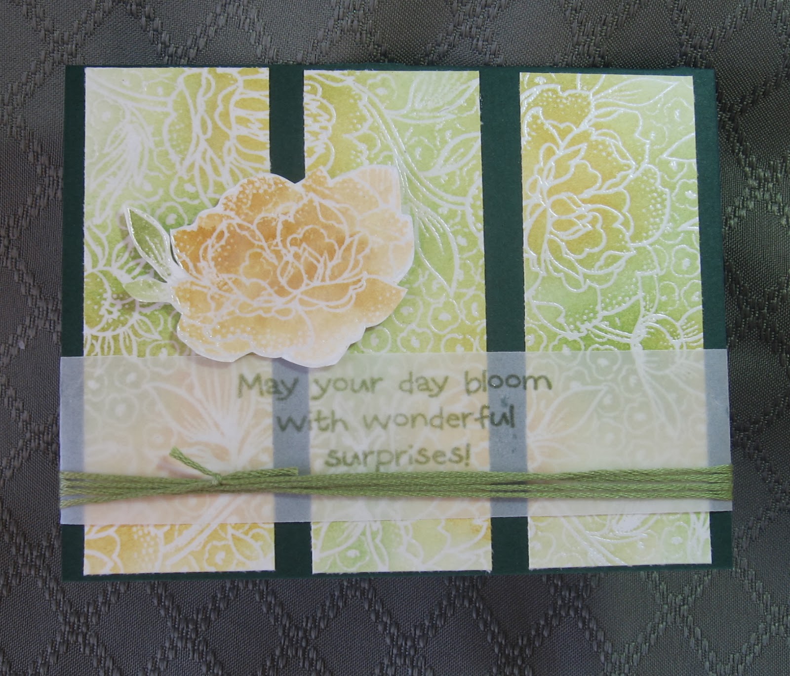
PS: After posting the card, I realized I didn't need to make it a tri-fold; so I cut it apart and remounted two of the panels on Very Vanilla cs. That leaves me with the extra panel for the front of another card later on.
CASCADE VALENTINE
The "dreaded pink" rises again! This time, at technique class last week where we learned how to make the cascade card...not that I would remember ;)
Basically, it's two angled pieces joined in the middle with slits in the folds so that one piece slides down over the other. Got that?
For a simpler version, however, you can look up "Concertina Card" on Splitcoast Stampers under tutorials. Beate's video is very easy to follow!
Basically, it's two angled pieces joined in the middle with slits in the folds so that one piece slides down over the other. Got that?
For a simpler version, however, you can look up "Concertina Card" on Splitcoast Stampers under tutorials. Beate's video is very easy to follow!
Tuesday, January 21, 2014
CORRIE TEN BOOM QUOTE
I really like how this one turned out! The glitter in the dsp gives it some sparkle, while the black keeps it masculine.
The verse is another one from a Sweet and Sassy set; and Corrie Ten Boom said it well!
TWO MORE PASTOR CARDS
In keeping with the snowy scene outside my tower window, I've used my tree die and torn paper "snow" for these cards.
First, I made a tri-fold 4 1/4" x 3 5/8" (from a 4 1/4" x 11" piece) and used the two-part verse so that the first half would be on the outside.
The second half is stamped on the inside flap, with another plain piece for the personal note on the inside center panel.
The second card (scroll down) is a top fold with Stickles painted on the tree with a brush. I added a narrow strip to ground the tree and verse which are mounted on a piece of embossed white cs that looks like bark.
Thank you Sweet and Sassy for such wonderful verses!
BYE-BYE JANUARY THAW!
It's snowing here again, and the night temps are going to be single digits the rest of the week. We were enjoying the milder temps for awhile, but it's back to winter now.
Good stamping weather, though!
Monday, January 20, 2014
ARGYLE DESIGN
Re-discovering a paper pad I bought ages ago, I came up with this card. It was very hard to photograph--it kept popping open. So here's a TIP: to keep a card shut while photographing, hold it shut with some temporary tape you can remove later.
The dsp along the bottom is actually on the inside of this top fold card. I just cut a quarter inch off to let it show. The dsp has glitter along the white criss-cross lines, and the white and silver bakers twine adds extra shine along with the three silver pearls on the left. Unfortunately, the gray cs looks a bit dull in the photo; but in real life, it's just right.
The verse is from a set of scripturally-sound sayings from Sweet and Sassy. Since we're expecting snow again this week, I'll be posting more cards using this set later...
Labels:
Pastor cards,
Postage Friendly,
Sweet and Sassy Stamps,
Tips
Sunday, January 19, 2014
HOW'S THIS FOR A CHALLENGE???
...and now for something entirely different...
I'm challenging myself to NOT BUYING anything new, stampingwise that is, for the rest of this year. The only exceptions would be using the SU gift certificate I got for Christmas and keeping the commitment I signed up for at Technique Tuesday (for the Greenhouse Society stamp of the month.) Surely I have enough in this room to last until next Christmas, even enough to supply my Mothers Class projects! It should be interesting to see how long it all really lasts, although I could ask for something I might need in Sept. for my birthday. I'm calling it the "stamping diet" ;)
I'll be keeping you posted (literally.)
Saturday, January 18, 2014
SIMPLE SATURDAY #33--Untimed
One more pastor card before heading off to my daughter's house to celebrate my son's birthday there. Although I forgot to set the timer, this card didn't take long!
I hope you will take the opportunity to reflect on the verses I post for these pastor cards. They make great "thoughts for the day."
Tuesday, January 14, 2014
BRRR...
I've used this Greenhouse Society stamp set for several cards, and every one of them has turned out great! It looks so realistic, and even has lines for where to place the Stickles or glitter for the snow.
The image is stamped with Versafine Smokey Gray ink on Very Vanilla and then torn along the bottom. Before coloring it in, I glued it to a piece of gray textured cs; then glued both to the card front. Usually I would mount it with dimensionals, but this time I must confess that I had to cover up my first attempt at stamping it directly on the card. Then I added the jute on the left.
The berries were colored with an orange glitter pen and the "snow" added, working from left to right so as not to smear the ink or Stickles with my right hand.
The Bible verse was stamped in the same Versafine ink directly on the card, and I was sooo happy that it stamped straight!
(The stamp set is from Technique Tuesday and the Bible verse is from Our Daily Bread Designs.)
Monday, January 13, 2014
ANOTHER PASTOR CARD
Thanks to the extreme cold this week, I've been on a roll for making pastor cards!
This one took all of 5 or 6 minutes to layer. First I stamped the verse on a scrap of vanilla cs and set it aside. Next, I cut the two layers of dsp, the woodgrain being the reverse side of the other. Then I attached some coiled jute to the paper with plain ol' Scotch tape which is covered by the verse mounted with SU dimensionals.
After adding some pearls, the card was done!
Sunday, January 12, 2014
MY FAVORITE STAMP
This is my favorite stamp for 2 reasons: one because it's just a natural backdrop for so many themes and two because my dad gave it to me many years ago. So here it is for another pastor card this week!
First, I stamped the tree on a white panel and then stamped twice more without re-inking. I used Versafine Olympia Green ink and a brown marker on top. I stamped the top again on a scrap and used Chestnut Roan for the verse over it. I had a tree brad in my stash that I added.
After punching a hole in the top left corner, I added some gold twine and mounted the layers as shown. Since the tree panel is mounted with dimensionals, the verse is attached with dimensionals on the right side only so they would both be the same height.
This is one of those cards that just "evolves" as you go along, and I love how it turned out!
BTW, did you notice that the last few pastor cards had a woodsy theme? I didn't realize it until this post, so I guess that trees must symbolize strength to my way of thinking...
SECOND DAISY CARD
The first card I made with this stamp was a lot more vibrant, but I like the softness of this one also. I started out with clear embossing over Versamark ink, then watercoloring. After cutting down the watercolor paper to the size I wanted, I sprayed the panel with Shimmer Spritz Sparkle for an equally subtle effect.
Next, I added the greeting and embellishments, mounted the panel to a golden cs and attached it to the deep purple card base.
Done!
(Click to enlarge for a closer look.)
Next, I added the greeting and embellishments, mounted the panel to a golden cs and attached it to the deep purple card base.
Done!
(Click to enlarge for a closer look.)
Saturday, January 11, 2014
Friday, January 10, 2014
Thursday, January 9, 2014
New Stamps!
Yesterday I stopped in at Hobby Lobby to pick out a numbering set, and here's what I came out with. Not only does it have numbers in a variety of styles and sizes, but it also has some bar codes for the back of my cards! The narrow bar code says "expensive"--very appropriate for all of us who create cards, dontcha think???

This should make a nice notecard during the month of January.
TIP: When gluing down delicate thin pieces like this word die cut, I use TomBow Mono glue. First, I put tiny dots on the back at the widest spots. After mounting it on the card and letting it dry, I place a dot of glue on a piece of scrap and gently slide it underneath any loose spots. This applies the smallest amount of glue so that it doesn't ooze out all over the front.
Wednesday, January 8, 2014
WINTER TREE
What better symbol of winter is a barren tree (except, perhaps for a snowman!) Imagine if you had never seen a tree with leaves how impossible it would be to imagine what this tree would look like in the summertime. Then try to imagine the things referred to in this Bible verse.
Even more impossible is to imagine the eternal future of God's people!
Tuesday, January 7, 2014
SUB-ZERO WEATHER...
...EXCELLENT STAMPING OPPORTUNITIES!
I saw this designer paper on the rack at Hobby Lobby months ago, and today is the day I decided to use it. What better use than for one of the cards I've made for our pastor.
After cutting a piece to size for the card, I matched it up with a larger piece of kraft paper from my stash. When I cut it, I made sure to center the main design for a simple card with an emphasis on the Bible verse presented on the front.
The Martha Stewart punch seemed to fit the pattern perfectly, allowing a little more of the kraft paper to show through. The dots matched the colors in the design, as did the jute.
This was an easy card to layer and finish.
Friday, January 3, 2014
WINTER BIRTHDAY CARD
When I came across this card already embossed, I thought it would make the perfect card for my friend who will be celebrating her birthday on January 10. Although it's hard to see here, I painted the flower petals with Star Dust Stickles and added crystal gems in the centers. The twine is white with a silver thread, and the greeting is silver embossed. It's very sparkly IRL!
Thursday, January 2, 2014
CLEMATIS IN JANUARY
I joined the Greenhouse Society at Technique Tuesday and believe me, that's the only way I like to get my hands dirty around plants! Whether stamping or gardening, I have a black thumb--except that with stamping, it's a lot safer for the plants...
I used watercolor pencils for the image, Olympia Green ink for the greeting and inside message, and yellow Stickles for the flower centers.
If you like to use botanical images on your cards, check out Technique Tuesday's monthly stamp, discount and automatic delivery HERE.
I used watercolor pencils for the image, Olympia Green ink for the greeting and inside message, and yellow Stickles for the flower centers.
If you like to use botanical images on your cards, check out Technique Tuesday's monthly stamp, discount and automatic delivery HERE.
Wednesday, January 1, 2014
ONE LAYER SIMPLICITY CHALLENGE
Being restricted to only one layer really is a challenge for me! I do like how this one turned out, however--in spite of the fact that I could have used the matching die cut ;)
To start, I masked the card with a 4x5" piece with the oval cut out and sponged a background with Tumbled Glass Distress Ink. Next I stamped the image and colored the bird and branches with chalks. I then stamped "thanks" (a little too far to the left than I intended) and finished by coloring the berries with a Jelly Roll pen.
To bring out the white of the bird, I used the Picket Fence Distress marker which covers the blue ink from the background nicely.
This stamp is a favorite of mine since we have so many Black Capped Chickadees at our bird feeder.
Subscribe to:
Posts (Atom)