Sunday, August 9, 2015

CASEing the Catalog--Butterflies

SU catalogs are so helpful when you run dry on ideas.  I just look through the cards, whether I have that particular stamp set or not, and go for it.

This card is CASEd from the one on page 107.  Their card with the butterflies in circles inspired a design of my own with the butterflies on top of the circles.  Using the Boho dsp really helped keep it coordinated.

Their card is square, and they used the negative punches for the butterflies.  Mine is rectangular, and I used the positive punch outs with another small butterfly on top.  For embellishments, I used purple gems for the bodies and a turquoise sequin on the banner.

I just love the bold colors in this dsp collection!

Wednesday, August 5, 2015

MORE BUTTERFLIES


The panel on this card was made with overlapping scalloped ovals of SU dsp, glued to a scrap of white cs.  Before coating it with one layer of clear embossing powder, I ran it through the Big Shot to give it some texture.  Then I mounted it to a black panel, tied the embroidery floss around it, and popped it up on the card front with foam mounting tape.

Next I stamped the greeting, added some sequins, and punched out a butterfly.  I drew in the antennae, added a black gem "body" and painted the wings with clear Wink of Stella.

Here's a closer look at the embellishments and shine on the butterfly:

Sunday, August 2, 2015

AND THE WINNER IS...

...BONNIE KLASS!

Congratulations, Bonnie.  Your card will be in the mail tomorrow morning!

Tuesday, July 28, 2015

FORAL Z-FOLD CARD SAGA

This card gave me some trouble, and it took me a couple of hours to get it under control.  Here's what happened:

I came across a previously folded card in my stash, apparently left over from a class I did on Z-fold cards.  No problem there.

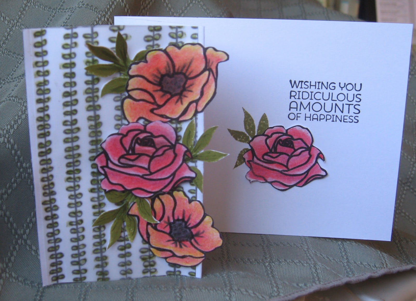
After deciding to use these beautiful roses from Penny Black's "Petal Power" and stamping them on white cs, I colored them with colored pencils.  No problem there either.

Next, I stamped the leaves with Peeled Paint Distress Ink and fussy cut them. Still no problem.

Then the "fun" began:  I decided to add the pre-printed vellum as a background, coloring the back first.  Then I added a clear liquid glue on each side and mounted it to the front panel.  That's when the problem started--the vellum curled away from the paper!  I kept pressing it back down until it dried and finally adhered to the cardstock; but then, the cardstock began to curl too!  Unbelievable!  I was beginning to feel like I had entered the Twilight Zone as an I Love Lucy routine!  The paper just kept getting more warped.

Finally, I added another piece of cardstock on the back of the panel, using double-stick Scotch tape, to give it more support.  By then, a couple of hours had passed and it was time for bed.  I stood the card up and turned out the lights, hoping for the best.  The next morning, it was better, though still a little warped.

If you'd like to receive this card for yourself, just leave a comment and I'll pick a winner (or loser, depending on how you look at it) on August 1st.  Hopefully, it will flatten out in the mail!


Monday, July 27, 2015

Sunday, July 26, 2015

I LOVE BUTTERFLIES...

...CAN YOU TELL?

I made a bunch of these at once.  Here's how:

Using the SU Papillon Potpourri and Versafine Black Onyx ink, I stamped several on watercolor paper.  Then I colored them using a variety of  Distress Inks and daubers.  Then I used the coordinating SU punch and added tiny black gems for the body.  For the antennae, I used colored wire, twisted it once to form a loop at the bottom and attached them to the back of the butterflies with glue dots.  I then shaped the wire with my thumb nail.

For a final touch, I brushed each with a Wink of Stella pen. The dsp is from SU, and each butterfly is mounted close to its corresponding color.


Saturday, July 25, 2015

Bonnie's Background

Thank you Bonnie, (Stamping with Klass) for encouraging us to use a dark background once in awhile.  The dark cs used here really dramatizes a simple flower image from a Fiskars clear set I got at Hobby Lobby.

I used Twinkling H2O's to watercolor the clear embossed image.  Then I added a few sequins, stamped the greeting and mounted it tilted-ly (if that's a word) to the brown textured cs which I first attached to the white card base.  It's now ready to use for a quick note.

This whole card was super easy--thanks, Bonnie!

Friday, July 24, 2015

CRAZY BIRDS

Every once in awhile we do what I call a "stamp in" where we bring some white cardstock and stamp images from each other's sets that we don't have.  Then we take them home to use on a card.

Jackie had the Tim Holtz set of Crazy Birds that we just fell in love with, so I stamped a bunch of them to color later.  This one is perfect for belated birthday cards.  In fact, the facial expression is so cute, you almost want to be late on purpose!

I colored the bird with colored pencils, then drew the deflated balloon free hand, adding the string "attached" to his wing.  The birthday hat is a Jolee sticker.  Before mounting the image to the card, I die cut the scalloped circle around him, added a handwritten message and sponged the edges with green ink.  After stamping the belated bd message inside, the card was on its way.

Thursday, July 16, 2015

A WORD ABOUT THE MINISTRY OF CARDS

Yesterday, Gail, one of my friends at Bible Study, paid a visit to someone I had made a card for a few weeks ago who is battling cancer.  She told me that when she got there, she saw that my card was on display as a continual encouragement to the lady who had received it.  When I heard that, I was just blown away.  I'm so glad Gail called and told me that because I know people like to receive cards, but never realized just how much it can mean to someone.

Here are a few suggestions in making cards more meaningful:

1.  Make it timely.  A quick response to someone in need underscores your care and concern.  If you didn't hear right away, you could start with "I just heard..."

2.  Keep it simple.  It doesn't have to be a long letter.  In fact, based on my own experience, it's easier to "digest" a brief expression at a time when it's hard to concentrate.  This is one case where less is more.

3.  Be Yourself.  No need to be eloquent, just be personal.  If you knew the person who died, for instance, mention something positive that you'll remember about them, even if it's just their smile.

4.  End with something encouraging.  I usually include a short Bible verse and the assurance that I'll be keeping them in prayer, if appropriate to the person.  Otherwise, you could say that you'll be thinking of them.  BTW, if I use a Bible verse, I always put it on the front of the card so that when it's standing up on display the verse is visible.

I hope this helps take some of the apprehension out of sending words of encouragement!


Wednesday, July 15, 2015

THE CARD YOU HATE TO MAKE

One of my friends just lost her 36-year-old granddaughter, so this is the sympathy card I made for her.  After I finished it, I started another card (previous  post) to add to my collection.  I no sooner finished that when I got a phone call from another friend telling me that yet another mutual friend just had to put her dog to sleep.  Since she lives alone, it's an even sadder loss.  As if that wasn't enough, she also told me that another friend just got the news that her breast cancer has returned.

I hope the saying that things happen in threes is true!


ANOTHER PEG STAMPS CARD

The other day, two new embossing folders arrived in the mail.  They are 3-D folders and what fun!

This one is a basket weave which I used for a floral arrangement.  To make the basket, I used the label punch and snipped off the point on the bottom.  After punching out some "ferns" with a Martha Stewart punch, I taped them to the back of the basket to hold them in place.  I then mounted the basket to a rectangular piece of cs.

Next, I proceeded to "fill" the basket with leaves and flowers using my peg stamps until I was satisfied with the look.  I then added the dragonfly and painted the wings with Wink of Stella for a little sparkle.  Since the dsp I used had triangles, I added three rhinestones in a triangle to finish it off.

This card went out to a friend who had to have her dog put to sleep yesterday.

Tuesday, June 30, 2015

Bohemian Birthday

This turned out to be a simple masculine birthday card.  I used my MISTI to line up the diamond stamps on the left.  I kept the stamps on the cover, but moved the paper each time so that everything came out straight up and down.

To line up the birthday greeting on the acrylic block, I first lined it up (smooth side up) on my grid paper.  Then I pressed the block, which has grid lines etched on one side, onto the stamp so that I could keep it straight along the diamond strip.  To finish off the card, I mounted the panel with dimensionals on a light green card (looks white here) and added the sequins.

I've added a few new tools in the Tower lately that have really been a help.  My faves are the MISTI, the magnetic platform for the Big Shot, and the mint-colored B plates which I no longer have to hunt for on my table.

PASTOR CARD SET

This is the card I designed for our pastor to use as a follow-up outreach for VBS.  He sends a little note to the non-church families who bring their children to our VBS program.

To make this card, I first stamped the verse and ran it through the Big Shot with the rectangular die.  The dsp strips were then cut at 1 1/2" wide to completely fit underneath the curved opening.  (To find the width you need, measure from the top of the curve to the lowest point.  Otherwise, as I learned from experience, you'll have a gap.)

After cutting the SU Pear Pizazz cs 4 1/4" x     4 3/4", I die cut the curve and attached all the pieces to the card front as shown.  The leaf was cut with a die I bought at Hobby Lobby last year which has an outline die and another insert that embosses the veins in the leaf at the same time.  (Sorry, I don't know the company name.) I sponged the leaf with Distress ink and attached it to the card with a SU dimensional.  The pearls were added in one strip and curved to match the opening. 

Although time consuming with so many steps, this was an easy card to make.

Saturday, June 27, 2015

WAY TO GO, KRISTEN!

This card is for my granddaughter's graduation party tomorrow.  I used the sentiment from Cheerful Critters and made the flower from scraps on my table.  I'll be enclosing a gift card, of course.

All 4 of our grandchildren excelled in school this year, and we are proud of them all.  (Insert grandma brag here...)  Kristen will start High School next year.  Elliot also "graduated" from Kindergarten, Owen goes up to 5th grade, and Freddy will be a Senior looking at colleges.  WOW!  Where did all those years go?

We are truly thankful for all the Lord has been doing in our family, Christian schools and churches.  It is a wonderful blessing to watch your children and grandchildren grow in the Lord, especially now that they all live close by.


ANOTHER SHAKER CARD

I can't get over how much I've enjoyed using the Paper Pumpkin kit.  This card uses some dsp (not included in the kit) with lots of yellow--perfect for butterflies!

The triangles on the bottom and the sponging along the edges are to cover smudges that just appeared out of nowhere...true confession...  I also added a strip of the yellow dsp to highlight more of the yellow.

Matching envelopes are a fun way to complete a theme.  For this one, I pierced a butterfly image by using a vellum butterfly as a template, piercing through it.  Easy!


Wednesday, June 24, 2015

NEGATIVE HELLO

This is the fourth card I made after the three shown in the previous post.  I kept it really simple, using the negative space from the self-stick greetings supplied in the Paper Pumpkin I used.

The dsp is from a pad of SU 4 1/2 x 6 1/2" paper stack which I also found at the yard sale mentioned below.  The ticket corners were created with a circle punch to add a little interest without embellishment.  I'm amazed at how the dsp perfectly matched the paper from the Paper Pumpkin kit!


THREE OF A KIND

I recently took advantage of a SU yard sale to pick up a few retired items.  In addition to some paper packets and a few stamp sets, I also found a Paper Pumpkin that had never been opened.  Since it was half price, I thought it would be interesting to try it out.  The one I purchased was from Dec. 2014 labeled "Shaker Cards."

The first thing I noticed was that it was beautifully wrapped in tissue paper inside.  There was also a surprise gift of a paper piercing set which I plan to give to a friend since I already have one.

Next was a packet of pre-cut window sheets and frames for the shakers, the coordinating embellishments, the card bases for 9 cards and the matching envelopes.  They even included narrow strips of dimensional foam adhesive as well as 6 stamps and an ink pad square.  Actually, I was quite impressed with all that it contained.

The step-by-step instructions were easy to follow with photos of each step.  The card on the lower right was the first one I did as I followed the instructions.  I added the butterfly embellishment from my own supplies.  The next card was the top right on which I added a butterfly from a pad of SU printed vellum and a scrap piece of glitter rick-rack.

The card on the left was super easy to do after completing the previous two.  I simply glued the dsp to the front of the card, added the shaker ingredients and mounted the shaker window over it.  The butterfly was punched from the same color glitter paper as the "hello" and mounted with a glue dot.

For more Paper Pumpkin ideas, check them out on YouTube!

Monday, June 22, 2015

CUTE CARE AND CONCERN CARD

My friend, Jan, gave me an old packet of lightweight paper that she came across while decluttering recently.  Since it tore very easily, I thought it would work perfectly for a peek-a-boo card.

After stamping and coloring the image in "From the Herd" (SU!), I cut an X with my craft knife and ripped the edges as shown.  I added the sentiments inside and out from the same set. 

For a final touch, I coated the eyes with Glossy Accents.  Hopefully, this will cheer someone who needs a pick-me-up.

Sunday, June 21, 2015

NEED A QUICK CARD?

Colored cardstock and a generous piece of designer paper help get a card off to a good start.

After stamping this label frame, I colored the bird and brushed on  some Wink of Stella.  Next, I took the SU piercing template and used my paper piercer to outline the label.  Then I cut a rectangle around it and sponged the edges with blue ink, stamped the greeting, and mounted the image to the card with dimensionals.

For embellishment, I added a few shiny sequins.  I didn't time it, but I'm sure it was under 10 minutes to make this card.  Enjoy!

Saturday, June 20, 2015

SIMPLE SATURDAY #39

(Click to view heart details.)

Tuesday, June 16, 2015

RAINBOW RESIST

It's fun making your own resist paper with clear embossing powder and Distress inks!

After clear embossing one of the flower images from the SU Mixed Bunch set, I sponged in a circular motion over each of them.  After adding the bakers twine, tiny tag and coordinating sequins, I mounted the panel to the white card front with dimensionals.

Another easy card!

Monday, June 15, 2015

ALL SEASON STAMP SET

When I saw this stamp set on line, I knew it could be used for any season.  The verse is perfect for our pastor to make use of, although the trees and fence (one stamp) can be used for many occasions.  I used it for some of my Christmas cards last year.

To make this a summer card, I simple took two shades of green Distress markers and pounced them around the trees and fence posts.  Then I used my water brush to fill in the color. 

For a winter scene, I left the trees bare and added glitter along the top of the hill and around the fence posts.  For Fall, I would use autumn colors for the leaves; and for Spring, more yellow with less blending.

This set is "Winter Fenceline" from Serendipity Stamps.

Friday, June 12, 2015

DESIGNER PAPER INSPIRATION

Sometimes it's fun to start out with a piece of dsp and work around it.  This one had the red arc on the left side, so I mimicked it with the label and vertical sentiment.  The red sequin tied in the color a bit.

After adding 3 pearls on the right side of the arc, I ran the card through the Big Shot.  When smooshed under pressure like that, they look like pearly flowers.  (Ask me how I knew that...)

I'm discovering lots of ways to make better use of my dsp collection.  Look at the patterns in your stash and see what you come up with for inspiration--you'd be surprised at what you can use!

Wednesday, June 10, 2015

I'M BACK!

I spent weeks of tearing the StampingTower apart looking for my camera battery and charger, and I finally resorted to prayer in order to find them.  After all, the Lord knew where they were, right?  (Why do we use prayer as a last resort instead of starting off there???)  Anyway, I no sooner said "Amen" when He graciously brought to mind that I had moved the charger to another room where I was taking photos of memorabilia for my Dad's album.

This photo was on the disk, and I barely remember making these cards for our pastor.  Enjoy!

Sunday, May 24, 2015

MONOCHROMATIC CARD

After inking the flower with Versafine Imperial Purple and applying green marker for the stem, I stamped it three times without reinking.  Then I layered the panels as shown.

Very easy!

Saturday, May 23, 2015

GIFT CARD SLIDER

(Sorry for the blurring--I've been having camera problems.)

Instead of a gift card, I made a tag to use as a book mark.

For directions on making these cards, take a look at Dawn Griffith's videos on YouTube.  She does a great job, and her other videos are great too!


Tuesday, April 28, 2015

FROM THE SCRAP DRAWER--Birthday Blossoms

This top-fold card was made using scraps that were still on my table from previous projects which actually never made it to the Scrap Drawer.  The yellow and white panels were glued together in case I needed an extra during the Tuesday beginners class.  The green strip was also a left over which I cut in half and glued to the card front as though it went all the way across.

The flowers*  were stamped on a larger scrap of white cs, fussy cut and mounted to the panel with dimensionals.  The greeting was stamped on a scrap of yellow, punched out and mounted below the image with dimensionals.

The final touch was the addition of 3 tiny self-stick blossoms and some yellow Stickles to the center of the rose.


*SU "So Very Grateful"

Monday, April 27, 2015

THREE OF A KIND--Sorta...

Usually, I do three of the same image.  These three are from the same SU set*, so I figured that was close enough.

The poppy was stamped with black ink and colored with Distress markers:  Fired Brick for the bloom and Frayed Burlap for the bud.  I added the red line on the side with just a ruler and the same marker used on the poppy.  The Bible verse and twine were added before mounting the panel to the card front with SU dimensionals.  The final touch was the Wink of Stella (pen) on the blossom.

The bird was stamped in Smokey Gray and colored with 2 shades of blue markers, one of which I used to highlight the verse.  The border was hand drawn with markers.  The twine was added before mounting the panel to the card front with dimensionals.

The berry branches were stamped with Smokey Gray and colored with markers.  I decided to make them blueberries, enhancing them with Wink of Stella and Glossy Accents.  Then I added a double line on the side and a few sequins above the verse.

Aside from being from the same set, these three cards also feature hand-drawn accents, Bible verses suitable for Pastor cards and a CAS* design.  Please click on the photo for a closer look.

*CAS--Clean and Simple
SU set is, appropriately, "Simply Sketched"


Sunday, April 26, 2015

AUTHENTIC DOGWOOD STAMP

This stamp by Hero Arts is the only one I've seen (so far, anyway) that has Dogwood blooms with four petals instead of five.  There is a "Legend of the Dogwood" which is appropriate for Easter, but it requires an authentic 4-petal Dogwood blossom.

The leaves on this stamp are very dark, but I wanted the blossoms to be much lighter.  So I first stamped the image in Versafine Olympia Green and stamped a second image in Smokey Gray stamped off once.  I then colored both as shown with colored pencils.

Next, I cut the white cs close to the image on the sides, sponged the edges with Smokey Gray and glued it to the green dsp which I had already glued to the card front.  Then I added the lighter blossoms over the image with dimensionals.

The greeting, from the SU "Painted Petals" set, was stamped in the Olympia Green and mounted on the card with dimensionals.  The final touch of Diamond Stickles was applied to the centers of the blossoms.

This card is going to a Silver Stamper who is 88 and makes the most amazing cards!

Saturday, April 25, 2015

BIRTHDAY TULIPS

This card was made using a set from My Favorite Things.
After stamping the tulips and greeting, mounting on a matching panel of pearlized purple cs, and adding it to the bottom left of the card front, the REAL fun began!

It was a challenge to add just enough sparkle with sequins, dots and gems without overpowering the simple image.  This took longer than all the previous steps, but I'm finally happy with how it turned out.

Enjoy!

Thursday, April 23, 2015

FEMININE BIRTHDAY CARD

This was stamped three times across a top fold card using the floral stamp in the "So Very Grateful"  SU set.

After coloring in the images with markers, I glued on tiny flower embellishments I picked up at Hobby Lobby a few weeks ago.  Then I added the sentiment which is from an old SU set of wooden stamps, "Wonderful Words."  Since it will be a birthday card, I handwrote the word "you" underneath the "e" in "Celebrate," following the curve of the stamp.

To pull all the purple colors together, I used deckle-edged scissors along the bottom and added a 3/4" strip of purple pearlized cs on the inside and another narrow strip along the top of the card as a finishing touch.

The colors are a little bright; but after the winter we just had, I think it will be a welcome change!


Tuesday, April 21, 2015

MASCULINE CARD?

You don't usually expect to see pink blossoms on a masculine birthday card, but this is one exception.  It went to a friend of ours who lives just outside of Washington, D.C.  Since his birthday was at the height of the cherry blossom season,...well, you get the idea.

Inside reads, "with a cherry on top."  I also added, "Hope you get to enjoy the cherry blossoms!"

I think it got a laugh.

Sunday, April 12, 2015

FLOWERS THAT FLY

Couldn't resist CASEing Jill Foster's design HERE.

Using the  SU! Papillon Popourri and coordinating punches, I came up with this arrangement on a standard sized card.

The dashes on the left are from a Sale-a-Bration pad of vellum which I cut to 3/4" and taped to the cardfront with Vellum tape.  For the panel, which is popped up with dimensionals, I first white embossed the floral stamp from SU! Pocket Silhouettes, sponged over it with Broken China Distress ink, and added the jute.

The message (Technique Junkies) is stamped with Versafine Smokey Gray which matches the gray on the vellum strip.  The butterflies are colored with glitter pens and attached with glue dots.  The dots were added due to a tiny smudge that needed to be "camouflaged." 

Thanks to Jill Foster for a beautiful design!

Saturday, April 11, 2015

AMAZED CAT

This cat's eyes caught my eye in the Technique Junkies booth at the Stamp Show, and I couldn't resist.  I found the greeting in a birthday set at the Sweet n Sassy booth, and they make the perfect pair!

A very simple card to make. I started with Versafine Smokey Gray ink; colored the eyes, nose and mouth; added the saying and sponged the edges with gray.  After mounting it over the plaid dsp on an ivory card front, adding just one glittered brad and rounding the upper right corner, the card was done.

Easy!

Thursday, April 9, 2015

ANOTHER NEW STAMP

Since I use a lot of butterflies on my cards, when I saw this stamp at the Stamp Show, I knew it would get a lot of use.

The two small punched butterflies were sitting on my table from a previous project, so I had just what I needed to make use of my new stamp.  This is also the first time I've used this sheet from the Painted Blooms dsp from the SU! Sale-a-bration catalog.

I'm really happy with the way this folio card came together!

Tuesday, April 7, 2015

HIDDEN LETTER BIRTHDAY

I'm enjoying this newly-learned technique from Online Card Class!

TIP:  To add another word close to a raised image, place it on the bottom of an acrylic handle with the letters upside down.  Then stamp from the top of the raised image, which would no longer be in the way.  Of course, it would have been much easier to stamp it before adding the raised letters, but I forgot.

Monday, April 6, 2015

A PRE-SUMMER'S CAT NAP


This stamp by Impression Obsession reminded me of our tuxedo cat who loves to snooze in "her" chair on the front deck.  Today was the first day warm enough to sit a spell after a long, bleak winter!

I'm looking forward to doing the same thing in another few weeks...

Sunday, April 5, 2015

HAPPY EASTER!

HE IS RISEN, isn't He?

"If in Christ we have hope in this life only, we are of all people most to be pitied.  But in fact Christ has been raised from the dead, the firstfruits of those who have fallen asleep."
(I Corinthians 15:19-20)

Saturday, April 4, 2015

THREE OF A KIND--Floral

Margot's Flower is the title for this stamp from Technique Junkies.  I saw this at the Allentown Stamp Show and didn't even hesitate.  Today I decided to try coloring it three different ways.

First, I stamped it on a piece of watercolor paper and painted it with an aqua  painter and Distress Inks:  Fired Brick, Peeled Paint and Wild Honey.  For the center of the flower, I used Wild Honey and my Wink of Stella brush.  The black was done with India Ink Black.  I used a pale purple colored pencil to outline the image on the bottom and right sides.


For the second flower, I used colored pencils on Ivory cs.  I like to use 3 colors at a time, the lightest first.  Then I add the darkest and use the medium tones for burnishing.  The center was colored black, then I added some tiny black gems.

TIP:  I purchase alphabet sets of pearls, rhinestones, red and black gems to separate and use on cards.

The purple card was done with markers, which I find the most difficult to use on large images because they aren't as blendable as the other media.  After I took this photo, I added more purple to the outer areas of the petals, leaving more white (and contrast) toward the center.  The center was done with a lime green Spica pen.

It was quite a challenge to come up with three different ways to color this image, but I like how they turned out.  My favorite is the first one (watercolor).  What's yours?


Wednesday, March 25, 2015

HIDDEN LETTERS

Day 7 of Online Card Classes was all about letter dies and different ways to use them.  I made this card for my grandson who is turning 17 on April 6.

Can you find the hidden letters?
(Click to enlarge.)

Monday, March 23, 2015

BUTTERFLY SYMPATHY CARD

This is another card using a border die in a different way.  The previous card used the rick-rack border vertically, this one horizontally.  Unfortunately, it will be used for a sympathy card that will go in the mail today.

This is a great way to use up some scraps!


Sunday, March 22, 2015

Zig Zag Pastor Card

Using a border die for the middle of a card is a great way to extend the use of those dies.

I had picked up a pad of glitter paper last week by Die Cuts With a View.  The glitter in this stack of 6x6" papers is soft and smooth, not as glitzy as other glitter papers I've used before.  It almost feels leathery, if that makes sense.

To start, I chose the four colors shown here and cut them with my die.  I then attached them to a strip of  Post-It tape to hold them in place while I added them to the middle of the ivory panel.  Next I taped the panel together with regular Scotch tape on the back.  Then I ran the panel through the Cuttlebug again with the stitched rectangle die.  Once that was cut, I taped it with ds tape to the dsp mounted on the front of the card.

After stamping the Bible verse and tying some dark brown cord around the left side, the card was done.

Just a note:  Because I used my Fiskars stamp press, I was able to go over the verse in a darker brown than what I had originally stamped it in.  I figured if it didn't match up exactly, I would stamp it again on another piece that I could mount over it.  Thankfully, it worked the first time!

Friday, March 20, 2015

BUTTERFLY BIRTHDAY

Online Card Classes have been offering lots of new ways to make use of our many dies.  Shari Carroll inspired me with her card today in using a stamp and die set to create a window with dsp behind the opening.

After stamping a piece of acetate with white ink and embossing with white ep, I attached it behind the matching die cut and popped the panel up over the dsp and a coordinating side strip.  The sequins, bow and glitter paper provide just enough bling, while the embroidery floss gives the card some color and texture.

The inside verse reads, "May your spirit keep the freedom of a butterfly in spring, may your heart be filled always with the joys of simple things...etc."

If you haven't tried an Online Card Class, treat yourself to one of them soon--you'll learn a lot of neat stuff!.


WINTER'S LAST GASP!

It's snowing like crazy around here today!
We already have 3 inches on the ground, with more on the way.
I have a stamp that says
"No matter how long the winter,
Spring is sure to follow."
Hope abounds...


Thursday, March 19, 2015

HAPPY SPRING!

With another 3-6" of snow expected on Friday, this card may have to wait a bit longer before mailing!  Seems like the seasons are alternating this week.  Yesterday was very windy and cold (high of 34) today near fifty and tomorrow more snow, then up in the 40's again on Saturday.

I have a stamp I might use for the inside of this card:

"No matter how long the winter, Spring is sure to follow."

Wednesday, March 18, 2015

Meow Card

I couldn't resist this cat dsp I saw at Hobby Lobby!

Using the cat die from last year's Halloween set, I made it look like Jenny.  The inside will remain blank until I decide what to use it for.

Meanwhile, Jenny (my "stampin' buddy") has a new bed in the tower where she likes to keep me company.

Thursday, March 5, 2015

I'M BACK!

Thanks to all the snow storms we've been getting, (every week!) I've had lots of spare time to get creative.  I'm finally caught up with all the other things I've had to do, one of which was to send out 20 thankyou notes to friends who supported me with their prayers during the difficult days away from home with my dad during his last days.  When I got home, there were flowers, homemade soups and visits to help lift my spirits.  The Lord has truly blessed me with wonderful Christian friends.

Please scroll down to look at the cards I posted today.  It's been snowing (again!), but I think this may be the last of it until next winter.  I will NOT be sad to see it go, and neither will my cats!  Meanwhile, the stamping tower has been providing the opportunity to relax and stamp up a storm (excuse the pun.)

SCRAP DRAWER #48--CONTINUED

Nothing says Spring! like butterflies and blossoms.  Here are the first of five cards I made with the tags I punched from my scraps (shown in a prior post.) 

These should make good encouragement cards.

SOMETIMES WRONG IS GOOD!

The weather forecasters were all over the scale in predicting the amount of snow we'd get today.  So far, we have 3" of new snow, but it has stopped here.  We were told to expect amounts up to 10 inches!  I sure hope this is the last of it for this season.  We haven't seen the grass since late January...time for crocuses and daffodils.  Even our cats have cabin fever!

I'm soooo glad the weather predictions were wrong this time.

FROM THE HERD

This stamp set just cracked me up when I saw it in the SU! Occasions catalog.

For this card, I used colored pencils which made it easier to get into small places.  I just adore all these faces, don't you?

After coloring everything in, I decided the pig was just too pink.  One of my friends suggested it was because he was too clean for a pig, so I added some mud.  I like that much better!

This is one of those stamps that does all the work for you--just stamp it, color it and mail it.


PS.  Check out a really clever card on Split Coast Stampers using this set.  I saw it when I posted this card there earlier.  It's the one that's to the right of mine.

SCRAP DRAWER #48

 My new SU! tag punch has come in handy.  I pulled out my dsp scraps and went crazy with it--what fun!

Can't wait to use these on some Spring cards...