Friday, May 23, 2014

Rainy Day Fun


Actually, it's not raining today, but it sure is dreary--chilly and damp after all the rain from last night.  So I went upstairs to my tower and looked through the cards I made at Cyndy's Technique Classes.  This is my version of a card we made last Fall--easy to make and fun to embellish!

Thursday, May 22, 2014

ONE LAST CLASS

Mothers Class is done for the year.  This is one of the designs we used for yesterday's class--after the wonderful breakfast we had!    First we stamped the flowers branch in white and colored over it with colored pencils.  They all came out different!  This one I did today, using a new die set that came in the mail.  (The cost will be covered by the gift card from the class.)

The other card we did was with the French Foliage set and three shades of green ink, one for each stamp.  The strip on the left was done with double stick Score tape.  After applying it along the edge of the fold, we pulled back the paper covering and added some green mini confetti and two shades of green glitter.  Next we stamped a panel (3 3/4 x 5 1/2") and popped it up on the card front with dimensionals.  Unfortunately, the photo doesn't do the card justice here--the glitter really sparkles and the raised panel adds dimension.

Both cards were easy for the Advanced Class to do and complete quickly (as usual!)  We were all amazed at how many new techniques we learned this year and look forward to even more next year.

Sunday, May 18, 2014

CHRISTMAS CARD DESIGN

Brandy Cox did a YouTube demo of this design which I have CASEd for some of my Christmas cards this year.  This first version  features a flap that goes over the entire opening and is held in place with the greeting.  She actually CASEd the new catalog (p. 127) for her version!  I thought this would work nicely for a Christmas card, so I came up with this one.  However, to mass produce it (I send 100 cards/year) the flap closure would take up more time, so I came up with the second version below.   I also reversed the colors to see which looks better.  Instead of the flap, the pieces are simply glued down on the front as shown.  I could still do it either way colorwise, but can't decide which color scheme I like better.  Which do you like best?

Saturday, May 10, 2014

WATERCOLOR BLESSINGS

Here's another attempt at using techniques I've been learning in the Online Card Classes for watercoloring.  This is the better of the two I did today.

After stamping the image from the SU So Very Grateful set, I water colored the leaves and blossoms, added the "blessings" and butterfly, and mounted the panel on green cardstock.  I used Barely Banana cs for the embossed panel and mounted the stamped image over it with dimensionals.  The base is Very Vanilla cs.

HAPPY MOTHERS DAY!

 PLEASE NOTE:  HERE is the corrected link to the online classes site.  There are many classes to choose from, so go for it!


WATERCOLOR ONLINE CLASS

It's not too late to sign up for the Online Watercolor Classes.  I'm learning tons of new watercolor techniques from the videos in this series.  They are so well done, and I'm inspired to go beyond the basics I already knew!

This card is my first attempt since watching the videos.  I used my peg stamps, some markers and my water brush to create this basket of flowers.

Enjoy!

Monday, May 5, 2014

DESIGNER PURSE

I got the idea for this card somewhere, but can't remember.  Anyway, I thought it was adorable so I came up with my own version.

Starting with a standard white card base, I stamped and colored the Greenhouse Society Chrysanthemums along the bottom two thirds of the card.  For the flap, I used a large label die and cut just over half of it out of the green cardstock.  At the center points, I scored it and secured the overlap on the back with sticky strip.

After punching holes for the ribbon, I knotted one end, ran it through the other hole and knotted the other end.  It was starting to look like a real purse!

For the final touches, I added the gems and rounded the corners on the bottom.  The greeting will go inside and the card will open at the bottom.

If you wanted to make it even more realistic, or include a gift card inside, you could start with the fold at the bottom.  After securing the sides with an accordion fold piece of matching cs,  you could then add a flap at the top opening.  Just secure it on the back and add a clasp, magnetic closure or belly band to the front so that it could be opened later.


Friday, May 2, 2014

THANK YOU CARD

This is one of the cards I made at Cyndy's technique class.  It will make a nice masculine thank-you  for our pastor to use.

(Click on photo for closer look.)

Thursday, May 1, 2014

GREENHOUSE SOCIETY CHRYSANTHEMUMS

Although this Greenhouse Society stamp for March is listed as Chrysanthemum, it looks more like a dandelion to me.  Of course, that's just a guess since we have NO dandelions in our yard!

This was stamped in light green and colored in with colored pencils, then mounted behind the green panel.  For texture, I ran the card front through the CB in a floral embossing folder and mounted the finished panel over it.

Very easy card!  Next time I do this, though, I will use dimensionals between the panel and the image to give it more depth.


Wednesday, April 30, 2014

GREENHOUSE SOCIETY POPPIES

If you enjoy using botanical stamps, check out the Greenhouse Society at Technique Tuesday HERE!

This poppy stamp is so delicate, it doesn't need much embellishment.  I stamped it with MementoLuxe Pistachio ink and clear embossed over it.  Using the same ink smeared on the acrylic holder, I watercolored the leaves.  I used Memento Rhubarb Stalk the same way for the blossoms, adding the black seeds with a SU marker.

After spritzing with a red marker, I mounted the panel on a piece of black cs and tied the embroidery floss around it.  Next I glued a scrap piece of green dsp to the red cs piece and mounted it on the white card front.  The finished poppy panel was then added using SU dimensionals.

Stamping with the light colored ink and using the same color for the leaves kept the image softer and less defined.  Clear embossing gave it just a bit of shine and also made it easier to stay in the lines with the water coloring.

Thursday, April 24, 2014

REMEMBER DEW DROPS?

I came across some dew drops in my stash yesterday and decided to use them on this card.  It seems appropriate on a card with water splotches!

The leaf is an Impression Obsession die.  It has a matching stamp which I did not use here.  After sponging three Distress Inks onto a white panel and die cutting the leaf, I splashed some water onto the panel.  Then I stamped the verse in Versafine Olympia Green ink and glued the panel to the Always Artichoke card front. 

After cutting three more leaves from white cs, I glued them together, glued the green one on top and mounted them in the opening with foam tape.  For embellishments, I added an embroidery floss bow on the stem, 4 pearls and 5 dew drops.

This is the second card I submitted to the Impression Obsession challenge.  Scroll down to view the previous card.

Saturday, April 19, 2014

IMPRESSION OBSESSION CHALLENGE

To think outside the box, I used the swirls from the branch on one die to create the "steam" for the latte in another stamp set.  I used vellum so that it is see-through in order to make it more realistic. 


The stamp set I used is "Smell the Coffee" which has the mug, the saying, and several other images.  By cutting off the steam after I stamped it, I was able to add my vellum pieces behind the mug.


The die is pictured here and is #058N.  It's a die I've used often and is especially useful for Anniversary cards.  When you use it, there are two hearts and two bird wings that are also cut.  However, until today, I never noticed them before because they're so tiny.
I happily used them on another card today.

LAST BOX CARD THIS SPRING!

This one's going to my Dad for Easter.

Friday, April 18, 2014

JUST TRUCKIN'


 I discovered this really simple slider mechanism on YouTube the other day and had to try it out!

This stamp set from Stampin'Up is an oldie but goodie.  I purposely hid the "punchline" so that it is revealed only when you pull the tab and move the truck forward.

To create the scene for this red pickup, I sponged the clouds with Broken China Distress Ink.  The truck, road and grass were done with colored pencils.
The flowers and the driver were done with markers.
The hub caps are candy dots from Stampin'Up.

For  the video on how to make this slider,
visit Meg Loven's blog HERE and look for the
Slider Card video.  Thanks,  Meg!

Since this is going to someone recovering from surgery, I wrote:  "Why is it that when we want to take it easy, we can't.  But when the doctor says to take it easy, we don't.  So follow doctor's orders and milk it for all it's worth!  Happy Healing!"

Sunday, April 13, 2014

HEAVY METAL

This was my first attempt at using copper on a card.  I really like the color effect you get when it is heated.  After a half hour of trying to use my heat gun, I finally gave up and headed for the kitchen.  I placed the punched piece of copper in the toaster oven, and after 6 and 1/2 minutes on "toast" it finally turned deep orange.  It looks much better here; but IRL it is all one color.  The center flower was punched from an unheated piece for contrast.

Although it didn't turn out the way I had hoped, it will still make a nice Easter card.  Meanwhile, I plan to try again tomorrow morning with my BIC candle lighter in the hopes that an open flame will do the trick.  I'll be doing it in the driveway so I don't set the house on fire!

Saturday, April 12, 2014

BACK FROM DISNEY WORLD!

Rick and I had a wonderful time in Florida soaking up the bright warm sun--it was wonderful!

Once we got home, it was back to the normal routine with Mothers Class on Wednesday.  Thankfully, I had made up the kits for class before we left.  Then it was off to Wegmans to do the grocery shopping.

UPDATE ON CHALLENGE:  Yesterday, I HAD to buy a few things at Michael's for the class next week  We are going to CASE a card posted by Bonnie Klass HERE..  (April 10 post)   I also wanted to do some mini milk cartons for Easter treats and was going to use a template I found online.  However, while looking in Michael's for the copper sheets needed for the card, we (Evelyn and I) found a pkg. of 24 milk cartons which we decided to share.  With a 50% coupon, it cost only $5.  With some additional watercolor brushes for the class, a pkg. of mini-clothes pins to hold the cartons closed and some embroidery floss and twine, I spent less than $20.  Not bad for holding down the spending since February 1st--and mainly for the class!

OH!  I ALMOST FORGOT!  I WON A STAMP SET FROM PENNY BLACK!!  It should be in the mail on Monday, and I'll show it to you then.

Meanwhile, I hope you're all enjoying some mild, sunny Spring weather this weekend!

Tuesday, April 8, 2014

PSALM AND STAMP

This combination of  a Sweet n Sassy stamp and a stamp/die set from Papertrey Ink make a great Pastor card.  The dark blue cs and striped dsp keep it masculine in spite of using a flower.  The pearls are just enough embellishment, and they pick up the dots in the dsp.

I enjoy making these pastor cards and he enjoys using them...couldn't ask for a better combination!

Monday, April 7, 2014

A LITTLE HUMOR!


This stamp was sooo me, I couldn't resist adding it to my collection!

After stamping it on a scrap of white card stock, I cut it apart so that I could put the punch line inside.  The "confusing" arrows seemed the best way to convey the thought.


TIP:  Before gluing down the arrows, I placed them on the card and took a picture of them with my Iphone so that I could remember how I had them arranged.
Hope this gives you a laugh!

Friday, April 4, 2014

HAPPY SPRING SLIDER CARD

This card is going to a friend in Florida, but is also the card we'll be making in Mothers Class next week.  The card base is from a kit I purchased at the Allentown Stamp Show from the Paper Cut booth.

For class, since we've already done a card with the tulip stamp, we'll make it an Easter card.  The kit makes it easy to assemble once it's stamped and decorated.  I'm looking forward to seeing what they come up with!

Wednesday, April 2, 2014

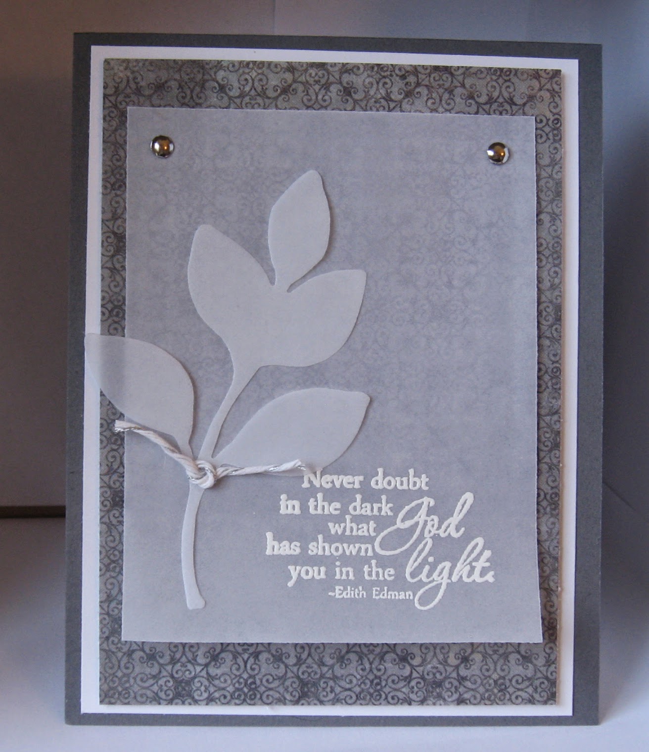
THE VELLUM TOUCH

Vellum softens a card so beautifully, I really should use it more often. 

After white embossing the sentiment, I attached the vellum to dsp and white card stock with silver brads.  Then I mounted the panel to a darker gray card front with dimensionals.  The leaf is attached with vellum tape which doesn't show through.  For embellishment, I added some white and silver bakers twine.

This is another pastor card.

Monday, March 31, 2014

IT'S BEEN AWHILE!

I've been extremely busy, but not too busy to stamp.  Just too busy to post (sorry.)

This card was done with colored pencils, and we made a bunch of these at Mothers Class last week.  It's always fun to see how everyone's cards all look so different.  The stamens were added later with black Stickles, and a Spring-time sentiment was stamped  inside.

Most of the snow around our house has melted--finally!  There's still a few clumps here and there, but we can see the grass again.  I saw one of our purple crocuses in bloom today, too.

The cats were out for a bit this afternoon while the sun was shining on the deck.  They looked soooo happy.