Tuesday, March 29, 2016

Big sister to the little rose in the previous post from the SU! "Birthday Blooms" set.

I stamped this on watercolor paper with Versamark and clear embossed it.  Then I used my  Peerless set to color in the rose and leaves. When it came time to mount it to a card, I first added the dsp and white glitter ribbon for the backdrop.  Then I mounted the finished image to a slightly larger piece of black cs. 

For the final touches, I applied some Crystal Stickles to the flower center and a small embroidery floss bow.  The panel was then attached with dimensionals.

I can see why this is such a popular set!


TIP:  To add some new images to your collection, try swapping sets with a friend for a week at a time!

Monday, March 28, 2016

FEELING KINDA SAD

This little rose is often overlooked in favor of the larger rose blossom in the SU! :"Birthday Bloom" set.  It does make a nice card, however.

Friday, March 25, 2016

HE IS RISEN!

He is risen, indeed!

Just as I like to keep Christ in Christmas, I also like to keep His resurrection central to Easter when making cards.  We'll be celebrating with a family meal and an Easter egg hunt for the grand kids on Easter Eve, just before our daughter and her family leave for WDW the next morning.  This trip was their Christmas gift to their two boys and has been much anticipated.

The stamp I used is one from SU! that I've had for years.  I like to add a black dot for the eye and some green gel pen on the olive leaves.  With the dsp I used and the die cut blossoms, this card was a quick one to make.

I wish you all a Happy Easter!


Friday, March 18, 2016

PASTOR CARD FOR TEEN BOY

I thought this verse would be encouraging for a young man  heading off to college or out to the working world.  We could all use this reminder from the Psalms, don't you think?

The only embellishment here are the three color-coordinated sequins and the matching embroidery floss at the bottom.


Thursday, March 17, 2016

Wednesday, March 16, 2016

MASCULINE PASTOR CARDS, PART II

Using blocks of color or patterns helps in making a card more masculine--as long as there are no flowers.

I saw a version of the card on the left with the punched square, but I can't remember where I saw it.  My apologies to the designer.  The card on the right was a pretty standard design.  It really is easy when you use a pad of coordinated dsp since all the colors will match.

MASCULINE PASTOR CARDS

Our pastor recently requested some masculine cards, so this is one of the images I used.  Black and white certainly works for more manly cards.  Notice the absence of flowers.

To add just a hint of color, I added some beige and brown chalks on the geese.

These were simple to make once I came up with the design!


Tuesday, March 15, 2016

FLOWERY BIRTHDAY CARD

I must say, Stampin' Up was gotten better than ever lately.  This English Garden dsp is just perfect for Spring and early summer.  I also enjoy the bundles they've started offering in their catalogs.  (Not a sales pitch here, just praise for a job well done from a happy customer!)

Inside the card  reads "the best."  This set from Our Daily Bread Designs has a bunch of other greetings to follow "Wishing,"  which makes the set quite versatile.

Sunday, March 13, 2016

SUPER SIMPLE EASTER CARD!

This is one of my favorite Easter cards this year.  All it took was a panel of the beautiful English Garden dsp from SU!

After stamping the verse on the dsp and mounting the panel to the cardfront, I added the embroidery floss on the side.  For embellishment, I kept it simple with crystals in the center of the blue flowers and some tiny black "seeds" in the Hollyhock blossoms.

Friday, March 11, 2016

EASY EASTER CARD!

This dsp makes the perfect backdrop for these daffodils.  All I had to do was stamp the image twice, once for the main image and another to pop out the blossoms with dimensionals.

A little Wink of Stella and some gray pencil to ground the flowers, and it was done!

Thursday, March 10, 2016

SPRING IS ALMOST HERE!

This card was inspired by a tri-panel painting in my husband's eye doctor office.  This is a simplified version, but what inspired me was the colors used against the foreground of the white bare trees.

The inside stamp shown here is one I use often in winter cards as encouragement that Spring will always follow Winter, which is never too soon for me!


Wednesday, March 9, 2016

ALL PURPOSE BOTANICAL BLOOMS

I still need a few more Easter cards, so that's what I'll most likely use this one for.

These Botanicals and matching dies are amazingly versatile!

Monday, March 7, 2016

SIMPLE SATURDAY #43

I enjoyed a whole day of stamping
in the tower on Saturday, but never got to post this
because I came down with the flu bug
that's been going around.
After 36 hours of symptoms, I finally
started feeling better this afternoon and managed to
get some of the warm sunshine and mild temps.
Hope to have my energy back soon!

Sunday, February 28, 2016

PAPER PLAYERS #284

Paper Players this week is a sketch, and I also plan to give this card  to our pastor for his use..

I got the color scheme from a SU! pad of dsp I bought at a garage sale last summer.  I like the brightness of the colors, tempered with the gray.

As you can see, I'm still thrilled to use the Botanical Blooms dies.  The flower sequins have been in my stash for ages, and there were some purple ones that matched--amazing!

Check out the other entries HERE.

Thursday, February 25, 2016

HELLO, FRIEND


I thought it best to show the inside as well as the outside for this card.  To start, I covered the front with a piece of dsp.  Next, I added a strip of the coordinating dsp from the Boho collection.  Then I punched out the middle square and three dsp squares with the 1 1/4" punch.  Two dsp squares were glued to the purple strip, and the third was mounted on the inside of the card so that it shows through the punched square.


After adding the embellishments and the white embroidery floss  on the front, I stamped the inside and added some sequins. 


Wednesday, February 24, 2016

SCHOOL COLORS

Our granddaughter, a Freshman at the same school as her brother, also made High Honors this year.  Her card is done in school colors using some SU! dsp for the gold and cardstock for the blue.

The pattern is taken from the same book used in yesterday's post.  In addition to the die cut Botanical Blooms, I added some gems and gold thread for embellishment.  Flower petals were also enhanced with some clear Wink of Stella.

We are so proud of all four of our grandchildren--can you tell?.  They are all  doing well academically and in their sports and/or music interests.  Must be genetic! *wink*

Tuesday, February 23, 2016

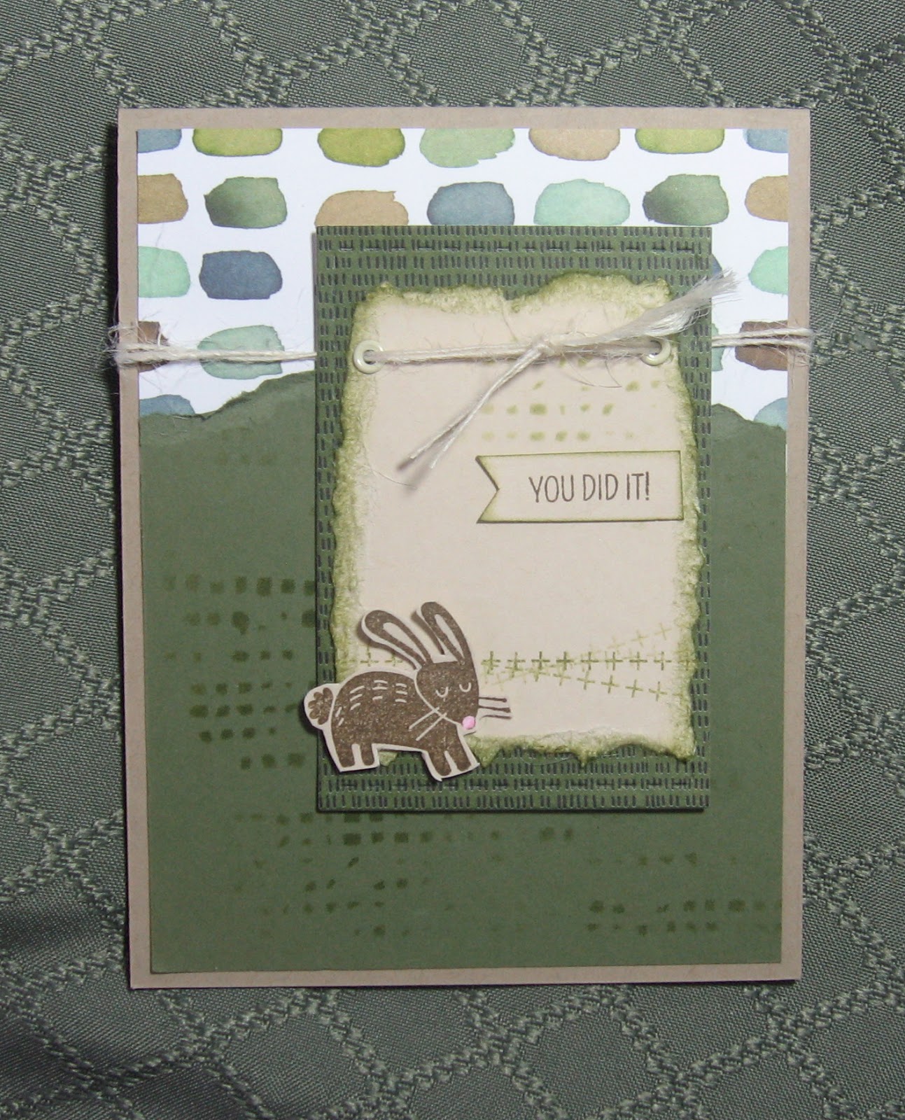
MASCULINE CONGRATS CARD

This is the card I made for my grandson who made high honors and will be going to the awards banquet next month.

The rabbit is the basis of some private jokes between him and my husband, so I included it here.  I'm sure he'll get a chuckle out of it!

The card pattern is from a book called "Originals" by Jeanette R. Lynton.  I bought it several years ago, and it's been sitting on the shelf in the Tower ever since. It has lots of ideas and layouts which I plan to try in the weeks ahead.  Then I plan to send it to one of my followers, so stay tuned!

Thursday, February 18, 2016

PAPER PUMPKIN FEBRUARY 2016--Alternate Idea

After cutting down one of the card fronts, I mounted it on a piece of light blue cardstock.  I stamped Hello and "birthday girl" and added some of the flowers from the stamp set included in the paper pumpkin.

Using a white card base, I glued the floral dsp from Botanical Blooms to it and mounted the stamped piece to the front of the card. Then I stamped the party hat on a scrap of white cs, fussy cut it and mounted it over the "o" with a dimensional..

Finally, I used some Wink of Stella on the party hat and added some of the sequins from the kit.to give it some shine.

Sunday, February 14, 2016

PAPER TREY INK CHALLENGE

This was a fun alphabet challenge where you used the letters in your name to make a new card.  Here's what my name required:
S for stitching
M for mixing of 2 stamp sets, one of which must be PTI
I for impression plate (Embossing folder)
T for twine
H for heat emboss

My card started out with a fern from the PTI Meadow Greens stamp and die set where I turned a fern into a fir tree!  How?  By using the negative space created by the fern die and then using the space as a stencil.  I sponged the "tree" with dark green ink, then clear embossed it.  The background was sponged with two shades of green ink and some blue for the sky.    After adding "snow" on the branches with a white gel pen, I used a stitched rectangle die.  Then I enhanced the stitched border with a black ink pen.

Next, I chose a pale green cardstock for the base and a dark green cs for the dry embossed border, even though the border shows only a tiny bit.  I wrapped some twine across the bottom of the rectangle and mounted it in the center of the frame with foam mounting tape.  Finally, I added the greeting from a SU! set.

Click HERE for the other entries.