Showing posts with label Taking it to the Top. Show all posts

Saturday, February 11, 2012

Another Way to Step It Up


Here's the first Easter Card I made for the Less Is More challenge, until I realized the color was supposed to be aqua; so I made the one in my previous post. Meanwhile, I decided to add some depth to this card. As you can see, initially it was "flat" and decidedly ho-hum.


However, just a few slits with a craft knife changed the look to a 3-D effect that is much improved. Hopefully, you can see the dimension added by cutting along three of the petals and lifting them up without foam tape. I also lifted the top of one of the leaves.


Just this little bit of extra effort makes a big difference!

Friday, February 10, 2012

Stepping It Up


1st photo: Since I wasn't happy with the card I made for the Less Is more challenge in the previous post, here is my attempt at taking it to the top.

2nd photo: I restamped the flowers, colored them, cut them out and popped them up on the card. I offset them a bit to create a "shadow" around the top and left sides. I then added yellow Stickles in the centers and rounded the top corners of the card.

3rd photo: Since I had some dsp that matched the color of the flowers, I used my rick rack die and placed the strip across the bottom of the image to ground it. The bold color also added some life to the card without overdoing it.

This is still a simple card, but I think it's better than before.

Wednesday, October 5, 2011

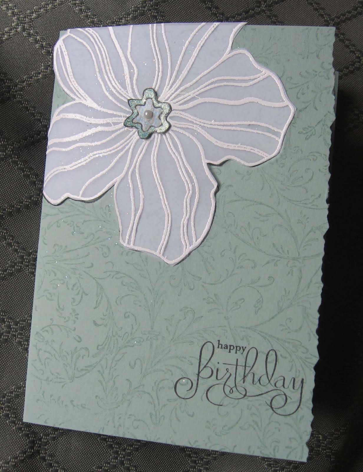
Taking It To the Top--Vellum Flower


After posting this card for the Less Is More challenge, I decided to step it up a little.


First, I stamped another Large Flower on vellum with Versamark and embossed it with white. I cut it out, attached it to the card and made a new flower center with a scrap piece of dsp.


Next, I added the rest of the matching dsp to the inside right edge and cut away part of the front with deckle-edged scissors. The final touch was to add silver cording on the inside edge, a little different placement than usual.


I liked it either way, but I think the vellum added some style!

Wednesday, August 17, 2011

Taking It to the Top--Christmas

When I finished this card, it just seemed to be missing something; so I redid it in steps:


First, I cut off the front panel and remounted it on Cherry Cobbler cs. Then I changed the sentiment and stamped it on a Nestie label. After I sponged the edges with matching red ink, I attached it with SU dimensionals. Then I decided the label was too big for this card, so...


... I moved the label to the inside and used my oval punches for a simpler greeting. I stamped the holly and berries with peg stamps and added some sparkle with green and red Spica pens. To balance it out, I also added some black dots in the upper right corner with a black Spica pen.

BTW, Spica (brand name) pens are a great way to add subtle touches on a card. Another handy tool is the plastic grid sold for cross stitching (?), which I used for the dots in the upper right corner. I sometimes use it for dots and/or dashes around the edges.

Tip: It's amazing how some household items wind up here in the tower, like the lint roller I use for picking up stray powders or paper bits off my work space. What non-stamping items do you use? Leave a comment! (Also, don't forget to sign up for email updates up at the top.)

Friday, April 29, 2011

Takin' It to the Top Revisited!


Having been inspired by the 411 Challenge in my previous post, I decided to redo this Less Is More off-center card posted on April 25th. (First photo.)

First, I used a scalloped square Nestability die for the bird image and sponged the edges with Sahara Sand chalk ink. For texture, I die cut a square of wavy green cs with a larger Nestability, mounted the bird in the center with dimensionals and set it aside.

With Crumb Cake cardstock as my base, I stamped the roses in Versamark to create a background and then mounted the squares on the cardfront. I made a new bow using green and cream embroidery floss, adding it below the image--a little brighter and warmer than on the original card. After sponging the small flower (Hero Arts) with Sahara Sand ink, I chose a small green button and a pearl for the center, placing it on the lower right corner of the image with a glue dot. (Second photo.)

Finally, I stepped it up once more by adding an additional white flower with an antique brad in the center. I also rounded the corners for a softer look. (Last photo.)

Thank you, Gretchen, for encouraging us to look at our cards in a new way!

Takin' It To The Top Challenge


This was a fun challenge suggested by Stamping 411 HERE.

To start, I pulled a simple birthday card from my stash and looked at it with new eyes. It was okay, but not really that special.


For Step 2, I decided to add some contrast with the purple strip from a scrap which happened to match the ink I used for the flower. Using a Martha Stewart punch complemented the scallops around the image. The embroidery floss "tied" the two colors together and added some texture.


For Step 3, I rounded the corners and added a double vellum butterfly. I'm much happier with this card now!