Saturday, October 22, 2011

FALLING LEAVES


Inspired by a pad of K & Company 12 x 12 designer paper, I mounted some leaves over them for some simple cards. All four leaves were stamped in Versamark ink and embossed with clear embossing powder.

Next, they were sponged with gold and brown inks to make them "pop" as the embossing resisted the ink. Each image was then mounted as shown, using a minimal amount of embellishment.

I plan to use these for November birthdays and note cards. Meanwhile, I'm posting them under "Simple Saturday" even thought I didn't set the timer. Stamping and assembling in assembly line fashion really is quick!

Sunday, October 16, 2011

SCRAP DRAWER #11


It's been quite awhile since I've done a card using the scraps accumulating in the drawer. This one makes use of some Fall colors and a Martha Stewart punch.


Since it is not postage friendly, I'll be using it as a thank-you note that I can hand deliver.

Monday, October 10, 2011

AUTUMN CARD


After stamping the oak leaves from the French Foliage set and cutting them out, I sponged the edges with Tea Dye Distress Ink to give them some definition. I then attached them on the left side, one with a glue dot, the other with a dimensional. The greeting was stamped with dark brown ink and the embroidery floss was added. The corners were rounded to accent the scallops on the designer papers.

Although the card looked "okay" at that point, I felt it needed a little more interest. While I don't usually use a lot of gems on one card, this time it was just what the card needed...and it's still postage friendly!

Thursday, October 6, 2011

DE-CLUTTER CHALLENGE


I just cleaned out my desk drawer and roll top, so I thought it would be a good idea to challenge ourselves to clean out some drawers this week. How 'bout one a day???

In approaching my desk this morning, I brought a garbage bag with me and started to sort out one area at a time. First, I emptied the drawer onto the dining room table. Using a plastic tray for the items I would keep (like pens, pencils, paper clips, etc.)I decided piece by piece whether to keep or toss. Surprisingly, more than half was tossed--like "dead" rubber bands (they dry out after a few years!) and old receipts, paper bits, etc. You know...

Now that I'm done, I have much more space--not to fill, but to keep open so I can see what I do have!

Remember this "rule": store like items with like. Shallow plastic containers work well for pens and pencils, sandwich containers for coins, paper clips, or other small items, zip-loc bags for other odds and ends.

And here's a word of encouragement--I found an old envelope with $30 CASH in it!!!! Shhhh...don't tell Rick!

Wednesday, October 5, 2011

Taking It To the Top--Vellum Flower


After posting this card for the Less Is More challenge, I decided to step it up a little.


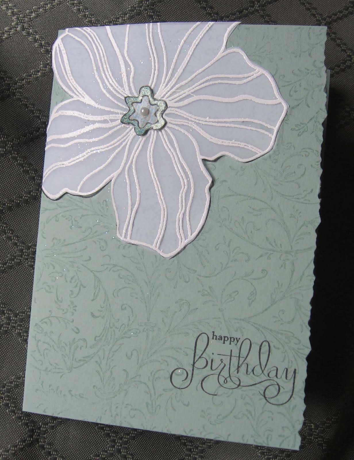
First, I stamped another Large Flower on vellum with Versamark and embossed it with white. I cut it out, attached it to the card and made a new flower center with a scrap piece of dsp.


Next, I added the rest of the matching dsp to the inside right edge and cut away part of the front with deckle-edged scissors. The final touch was to add silver cording on the inside edge, a little different placement than usual.


I liked it either way, but I think the vellum added some style!

Tuesday, October 4, 2011

DE-CLUTTER DE HOUSE

Now that the summer heat and humidity have subsided, clutter is calling again! It's time to start another de-cluttering series--are you up for it?

I've already started the Great Autumn Purge with the upstairs TV room that also doubles as a guest room. After investing in a set of coasters designed for moving heavy furniture, I was able to easily slide furniture around to make it more roomy, vacuuming the carpet as I rearranged the room. Soon it will be time to move the winter clothes back to the bedroom closet in exchange for the summer clothes there.

If you leave your comments citing your most challenging clutter spots, I'll try to come up with some creative solutions. After all, stampers ARE creative, right? Then, as we de-clutter together, you can also leave some of YOUR creative ideas and solutions! ARE YOU READY?

Saturday, October 1, 2011

LESS IS MORE--Eye Color


This Less Is More challenge is to make a card that is your eye color, although the exact shade isn't necessary. I was going to post a photo of the card held up to my face, but my eyes are way too red with allergies. (Maybe I should have made a red card!)

First I stamped the background with Versamark using the "Filigre" stamp from Stampin'Up. Next, I stamped the Hero Arts "Large Flower" with black ink. Using a green Spica pen, I filled in the center outline. Then, using a glue pen, I added Daffodil Yellow glitter in the center (although it looks white in the photo.)

With a GellyRoll glaze pen, I filled in the double lines on each petal of the flower for a subtle effect.

Finally, I stamped the greeting on the bottom right. Done!

SIMPLE SATURDAY #23

Monday, September 26, 2011

Halloween Joy Fold Card


This is one of the Halloween projects I designed for the Mothers Class. There are lots of pieces to assemble, but it should be an easy project.


The cat, pumpkin and "Eek" are stickers from a K & Co. pack I picked up at AC Moore. The bats are stickers from Jolee's Boutique. The purple gems are from Martha Stewart. The dsp is from a 12x12 pad also from K & Co. The stamp is from SU, "Hand-Penned Holidays."

Tuesday, September 20, 2011

French Foliage Thankyou


Fall is in the air, so it's time to get out the browns and oranges! This stamp set works well for any season, but is especially nice for Sept. and Oct. cards. All stamps and papers are from StampinUp! The inks are from a Kaleidacolor rainbow pad, Cappucino.

Enjoy!

Friday, September 16, 2011

Halloween Treat Cup


Here's one of the projects we made at Technique Class last night--LOVE it!

Cyndy had all the pieces ready for us to emboss, decorate and assemble. The wings were shaped with a circle punch, embossed with the spider web ef and attached to the cone. The "bat" was then sprayed with silver Smooch, the ribbon was attached with black brads and the eyes and fangs were added. Too cute!

I plan to use this for one of the Mothers' Class projects next month.

BTW, have you signed up to follow by email? (above right)

Sunflowers #3


Last time for the sunflower stamp! (...but not in real life...) Can't wait to see what the moms do with this stamp!

Thursday, September 8, 2011

Sunflowers #2


As you can see, I just LOVE this sunflower stamp from SU! While waiting for the sun to return and the rain to stop, I decided to make a few more cards with this giant stamp.

First, I applied watercolor crayons directly to the rubber. Then I spritzed the stamp with water and laid the paper over it. I spritzed again (lightly) and made a second print for a more subtle effect on a second card.

After cutting each image down to the size I liked, I mounted them on the cards as shown. For added interest, I stamped the bees, one in black and one in brown, cut them out and applied Stickles to the wings. While letting the Stickles dry, I assembled the cards.

I ran the edges of the first image across the brown ink pad. After mounting a yellow strip across the brown cs, I tied the embossing floss around it. Instead of using a double strand of the 2 colors, I did each separately for a different effect. After mounting the sunflower image with dimensionals, I added the sentiment and the bee. Inside, I used part of the strip I cut off for a 1/2" x 4" piece for the greeting and signature.

The second card was a bit more challenging. Since the image was so faint, I used brown ink for the bee and sentiment. The brown cs border, two-tone gems and yellow embroidery floss helped make the card "pop" after using brown ink for the splatter effect on the pale yellow card base. The completed image was mounted with thick dimensionals for a higher "lift."

The sun still isn't out, except for a brief "tease" earlier; but at least these cards make me feel a little sunnier!

Thursday, September 1, 2011

OUR POWER IS RESTORED--finally!

After five days of roughing it, we're very happy to have electricity once again. Our generator held up beautifully, allowing us to have foods stay cold or frozen, to watch TV, to have running water and to have one outlet for a lamp. I'm thankful for the beautiful weather that followed the storm, so we could use the grill for cooking. Also, that we had no damage to house or cars. For further deets on how we coped, check out the Fox Mountain blog.

Meanwhile, I used the sunlit hours to stamp away in the dining room. What better way is there to spend time in the aftermath of a hurricane!

Wednesday, August 17, 2011

Taking It to the Top--Christmas

When I finished this card, it just seemed to be missing something; so I redid it in steps:


First, I cut off the front panel and remounted it on Cherry Cobbler cs. Then I changed the sentiment and stamped it on a Nestie label. After I sponged the edges with matching red ink, I attached it with SU dimensionals. Then I decided the label was too big for this card, so...


... I moved the label to the inside and used my oval punches for a simpler greeting. I stamped the holly and berries with peg stamps and added some sparkle with green and red Spica pens. To balance it out, I also added some black dots in the upper right corner with a black Spica pen.

BTW, Spica (brand name) pens are a great way to add subtle touches on a card. Another handy tool is the plastic grid sold for cross stitching (?), which I used for the dots in the upper right corner. I sometimes use it for dots and/or dashes around the edges.

Tip: It's amazing how some household items wind up here in the tower, like the lint roller I use for picking up stray powders or paper bits off my work space. What non-stamping items do you use? Leave a comment! (Also, don't forget to sign up for email updates up at the top.)

Monday, August 15, 2011

Three of a Kind--French Foliage


Another set I ordered was French Foliage and a pack of Certainly Celery cs. What I love most about this set is its versatility--it can be used for Spring, Summer or Fall, depending on your choice of colors.

The first card is super simple, and will lend itself to a "Taking it to the Top" challenge. Using three colors from a Kaleidacolor Fresh Greens inkpad and Certainly Celery cs, I assembled the card as shown. Check back on Thursday to see how I step it up.

Next, are two wreaths using two different leaves. I thought it appropriate to use French Script for the background on the one with the Paris cancellation mark. The other features pearls for the center with a sentiment stamped in black and embroidery floss on the fold. This one is my favorite.

Jackie and I thought this would make a great Mothers Class project in the Fall with autumn-colored inks and cardstocks.

Saturday, August 13, 2011

Three of a Kind...


...but who's counting!

As soon as UPS arrived with my StampinUp order, I called Jackie with the news--and you all know it IS news whenever new stamps arrive! I packed up my supplies and headed for her dining room table to "play." At first, Jackie and I weren't too sure what to do with this giant sunflower stamp. What started out as an experiment turned out to be five cards, all different.

"Wishing you blue skies..." was done with watercolor crayons directly on the stamp and spritzed with Glimmer Mist. After stamping the greeting with Chestnut Roan chalk ink, I layered it on Soft Suede cs for the base.

Next came the birthday card using the embossed resist technique over yellow marble dsp and clear ep. After sponging around the image, I tore the left side and layered it on a yellow folio card. which I creased 3/4" from the fold.

Then we did a bd card with watermark ink and chalks. As a full-sized card, the balance wasn't quite right; but once I cut it down to a square card it worked much better. The embroidery floss and distressed edges added some texture.

Then we tried watermark ink on the Soft Suede cs and ran the edges across the ink pad to darken them also. It takes awhile for the watermark ink to really show up; but once it does, it pops. For bling, we stamped a bee, colored it with black and gold markers and applied crystal Stickles on the wings. Then we assembled the card as shown, using a dimensional for the bee.

Last, we went back to the first technique, spritzing with plain water and tearing around the image. After mounting it and popping up the greeting, we added some bronze Stickles in the center. I think next time I try it this way, it would look better to also have a straight edge on top just below the tips of the petals and mounted further up in the corner.

Of course, we didn't stop at one stamp--the others had to be tried too! Check back tomorrow for the next round. Meanwhile, please leave a comment and vote for your favorite!

Friday, August 12, 2011

Another State Fair Sweep!


All five cards that I entered won ribbons!

Since I won first place and the huge special pink ribbon in the Christmas category, the other Christmas card was given second place. The winner was a snowflake slider card that I designed especially for the Fair. The other is a tent card with a fireplace scene inside, although it looks flat here because of the paper clip.

In the other categories, the stair step birthday card won first place. (The second place birthday card is not shown here due to camera issues.) The floral card was another one that I designed for the Fair featuring a Martha Stewart border punch on the white and yellow edges, which was quite tricky to get right. They displayed it horizontally, but it actually is a vertical card.

All in all, it was a great State Fair! The weather was perfect the day we went, and the exhibits were quite inspiring, especially the quilts. I'm not into sewing any more, but truly appreciate all the hard work that goes into designing and making a quilt. The other exhibit I always enjoy is the photography one, with many of the photos reflecting the countryside where we live.

Sunday, August 7, 2011

BRANCHING OUT


Thanks to Evelyn for letting me borrow her new tree stamp and tiny embellishments.

First, I inked the tree stamp by using a pale green inkpad, then went over just the branches with a brown marker. After inking and stamping it three times on white, I sponged two of them with green and the other with blue. I ran one of them through the Cuttlebug with a large label die from Spellbinders.

After adding birds, balloons and birdhouses (Oh my!) I just love how they turned out!

Friday, August 5, 2011

I'M BACK (finally!)


Since my last post, I've been away from the Stamping Tower with Laura and family from Prague, the heat wave and a very bad coughing spell. Today is sunny, with lower humidity and a cool breeze wafting through the tower--so it's good to be stamping again.

As you can see, there are plenty of butterflies to enhance a card. The first was done with my Spica glitter pens, which give it a subtle shimmer, and attached with a dimensional. The pearls were added after coloring them with a light blue Bic pen.

The next butterfly is from an old SU set that I still love to use. After coloring the flower, I found a piece of dsp that matched perfectly. Again, a gold Spica pen was used in the middle of the butterfly.

Finally, a birthday card to go out today wishing the Silver Stamper recipient a "cool" birthday, evidence of my warped sense of humor. The snowman is mounted on the front of an acetate card, and the green oval behind him is mounted on the inside.

The next exciting event will be the delivery of my recent Stampin'Up order on Tuesday--yippee!